Inside style
Finding your joy
There is no one-size-fits-all when it comes to colour, says Anna Dick of Anna Margaret Interior Design.
IS COLOUR IMPORTANT?
Interior design always has a starting point: an object, colour or style. Colour can change a space from meh to wow; however, using a palette that our clients still love in 10 years, when colour trends have come and gone, is a real skill. At Anna Margaret Interior Design, our focus is on story-building, creating spaces that are cohesive and sympathetic to the architecture, location and most importantly, our clients. Interior design is about whatever brings you joy, and it’s very different for everyone, so balancing these aspects is where the art in design lies.
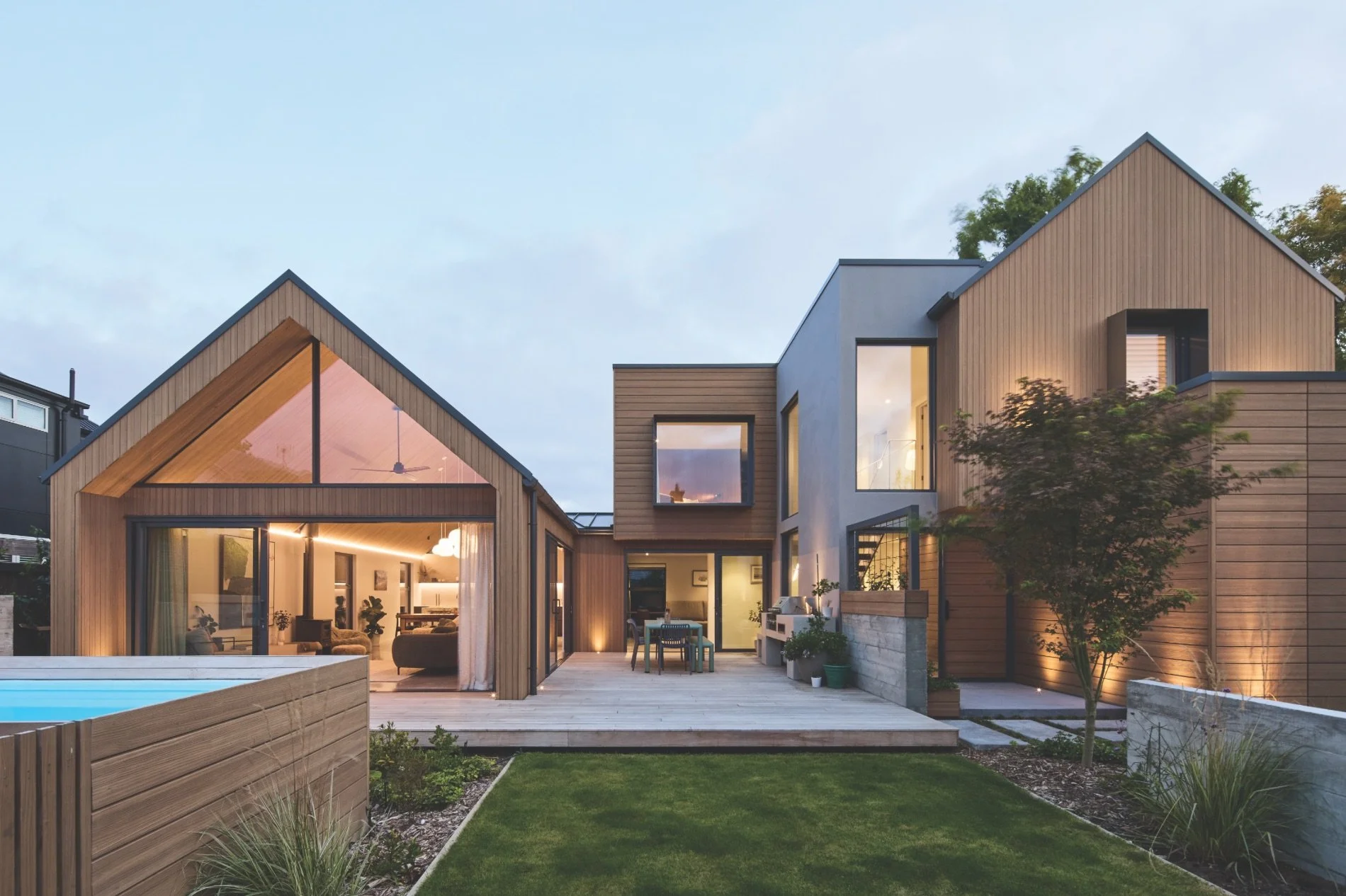
TELL US ABOUT THIS HOUSE.
This is an architecturally designed renovation, including an extension, that took a bungalow in Beckenham, Christchurch, back to its bones and reimagined it for a growing family. With two living spaces, two bathrooms and four bedrooms, it was thoughtfully considered for function, and then we wove through earthy, warm and natural aesthetics to suit the clients’ style.
HOW HAVE YOU USED COLOUR HERE?
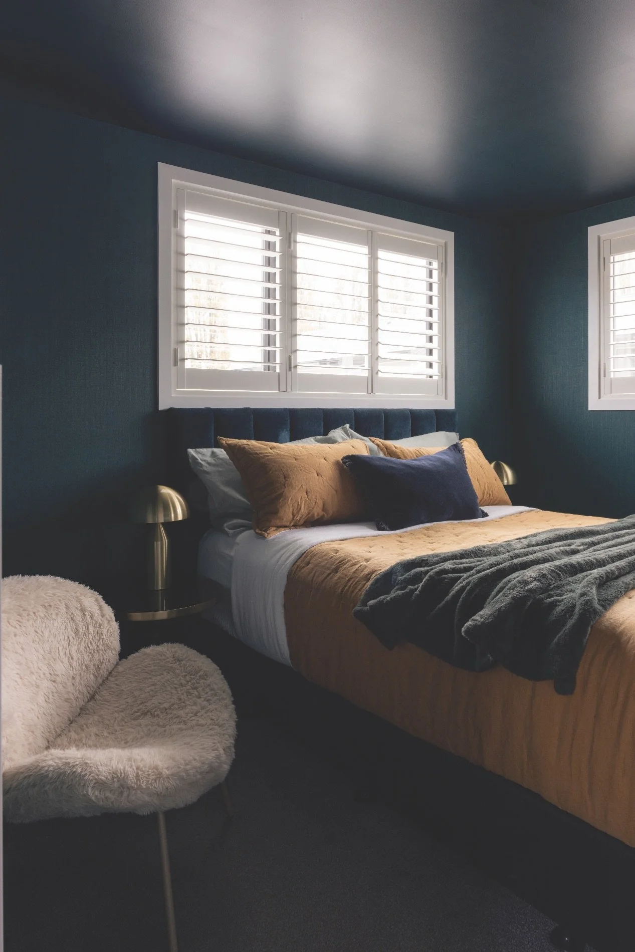
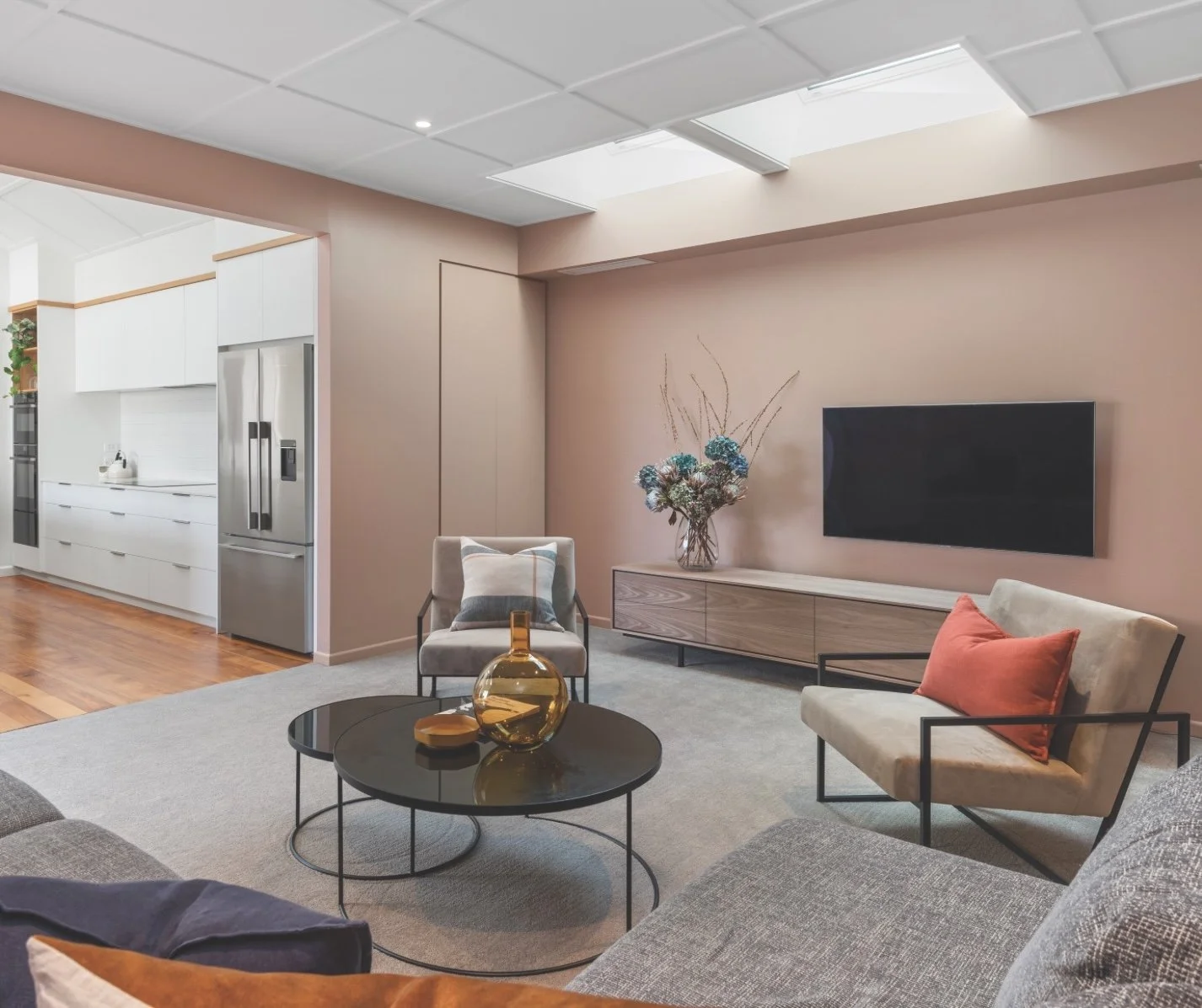
Initial consideration to the whole palette was the upcycling of the original home’s rimu woodwork and flooring. The client wanted each space to be calm and cohesive but with subtle points of difference. We loved the warm palette of colours that included Resene Rascal (in the living room), Resene Quarter Sorrell Brown (bedroom), Resene Foggy Grey (ensuite), as well as Resene Half Sisal, Resene Bud, Resene Birthday Suit, Resene Sea Fog, Resene Half Sea Fog, Resene Spanish White and Resene Terrain.


WHAT ADVICE DO YOU HAVE ON USING COLOUR?
There are many aspects of choosing the perfect colours for a home, and this can be overwhelming. It’s important to consider how colour behaves; what may look beautiful on the north side of the house may not work as well on the south side. Colour use in each space depends on what’s happening in that room. Do we want the colour to be the hero, or something else, such as joinery, art or a stunning view? Further, not only does the colour have to work with what’s going on in each room, it needs to have connections to all the spaces as you move through your home. We believe in choosing colour with purpose.
WHERE WOULD YOU START?
We’ll generally consider a neutral colour family as the foundation colour and add in double, half or quarter strengths. This gives scope to play with the same colour but have different saturations to help with different levels of light. We then incorporate other colours to expand the palette.
WHAT NEW FAVOURITES DO YOU HAVE?
At the moment I am loving the combination of Resene Del Rio and Resene Spanish Green with Resene Half Truffle. It’s a soft and warm combo with a lovely connection to nature, that can be used as a backdrop to so many other gorgeous colours: blues, terracottas, reds, charcoals or walnut.