Inside style
Better living
MJS Visuals
Colour has a major influence on the way we feel, says Jamie Durrant of Durrant Design.
TELL US ABOUT DURRANT DESIGN.
I started Durrant Design in 2020 and it’s now an award-winning interior design practice across New Zealand. I oversee every aspect of the design process from concept to completion and bring the best possible options to the table for our clients.
IS COLOUR IMPORTANT TO YOUR WORK?
I’m huge on colour because it really affects how we feel when we enter a space. Our houses are our havens, and if a colour doesn’t resonate on a personal level, it’s never going to feel like home. There’s an emotional connection with colour – that’s why it’s used so carefully in retail spaces and in company brands.
SO WHERE DO WE START?
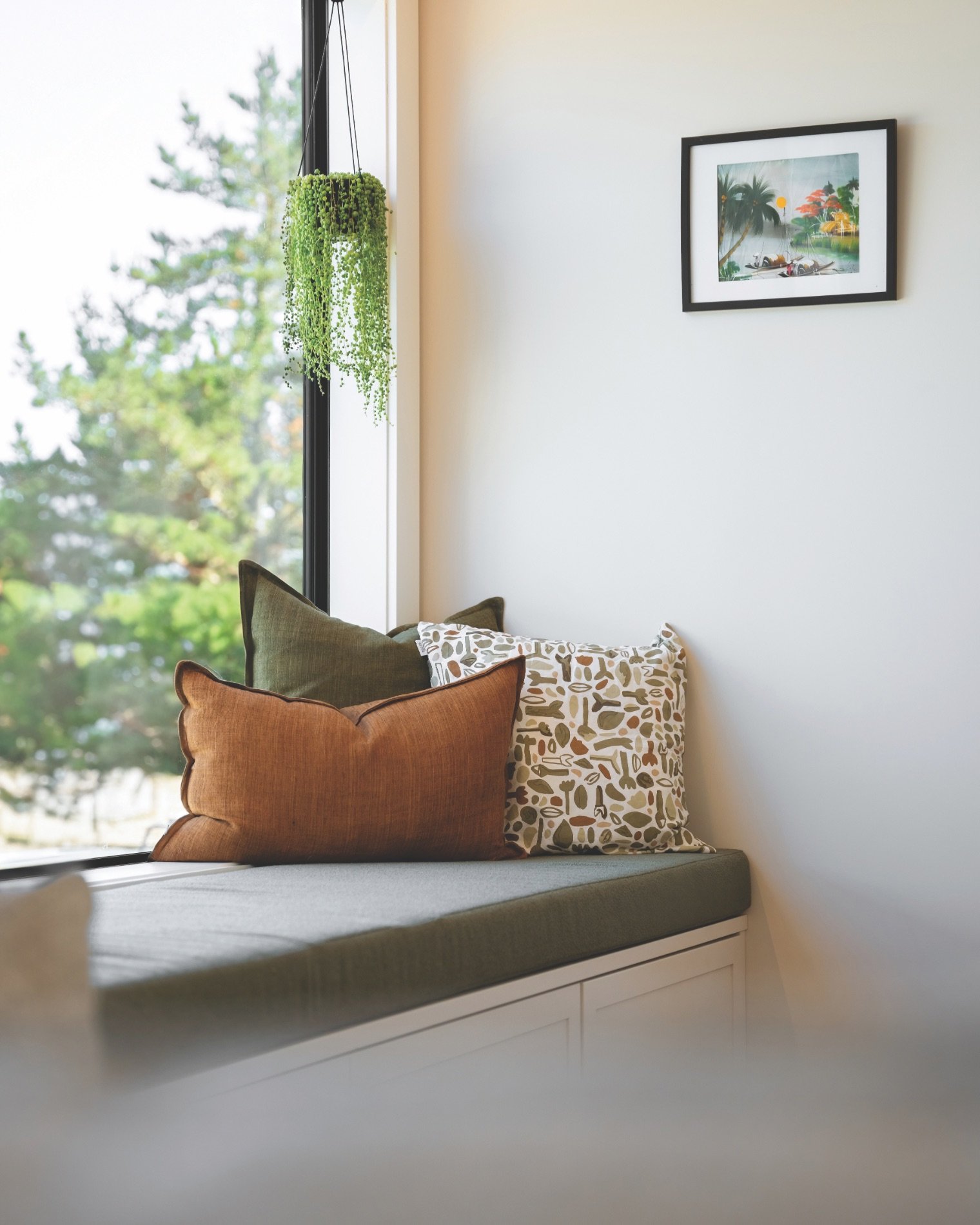
Think of what’s on your doorstep. Nature provides inspirational colour palettes, and we’re gifted with the most beautiful scenery here in New Zealand. Autumn colours – oranges, yellows and reds – look phenomenal together. In summer we see browns and greens, and the blues and sandy tones of the beach. It’s all at our fingertips.
DO WE HAVE TO GO BOLD?
The colours you bring into your home tell a story of who you are. If you look at the colours that are really popular at the moment and want to tone it down, look at pastel versions. It’s a great way to introduce colour without it feeling overwhelming.
You can also introduce colour through artworks, or fabrics and furnishings. As a backdrop for that, I often use Resene Rice Cake. It’s easy on the eye and creates a calm, creamy, neutral white. It goes with absolutely everything. You can bring in natural colours to complement it and it works very well with darker or bolder colours too. The more I use it, the more it seems to suit a lot of interior schemes.
I also love Resene White Pointer and Resene Wan White from the Karen Walker range. But if you don’t like plain white walls and want something with a little substance, another favourite is Resene Quarter Truffle, a subtle warm grey that works with everything.
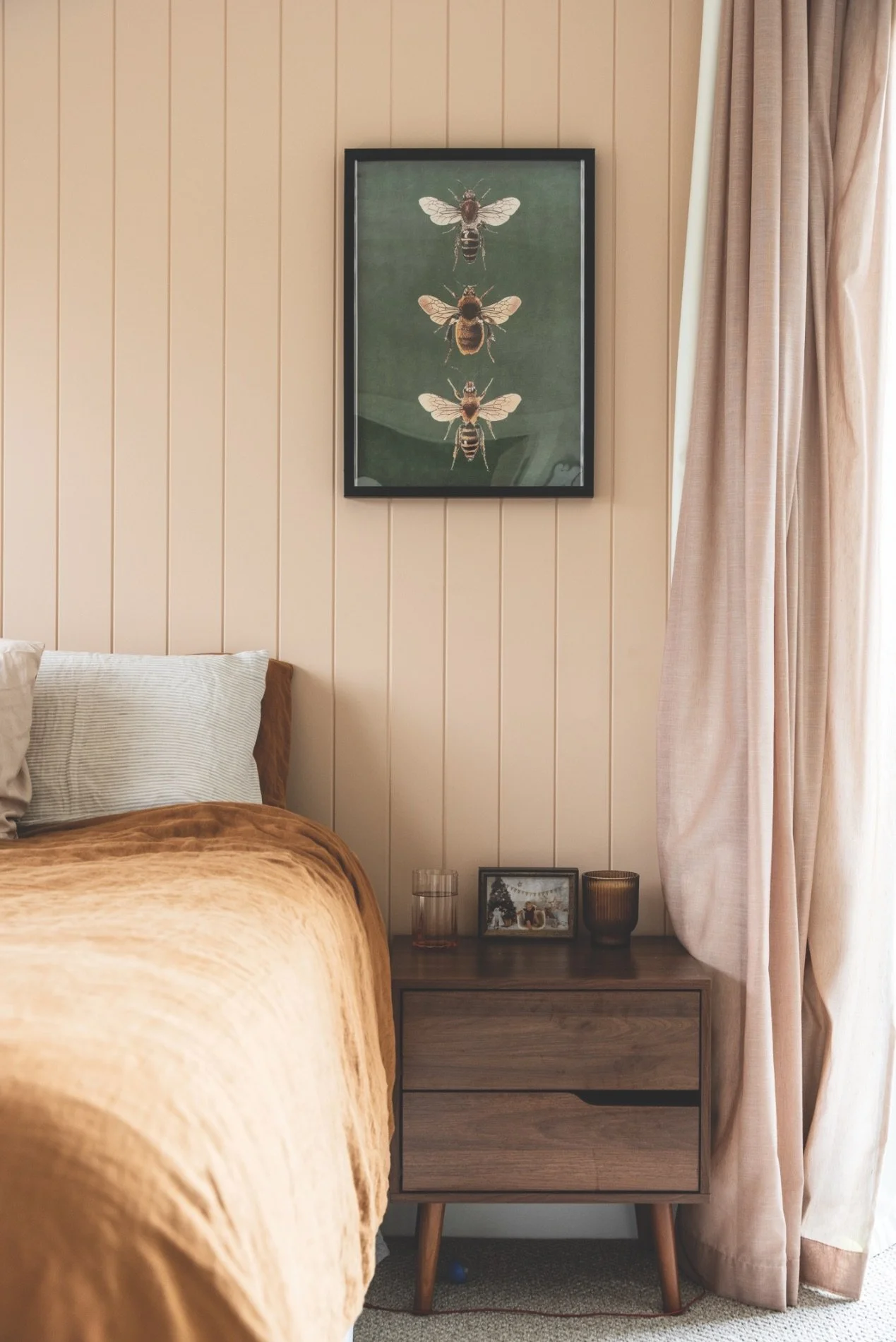
WHAT IS ON THIS BEDROOM’S WALLS?
It’s Resene Shabby Chic. It’s a beautiful, almost nude blush tone that leans more towards a neutral than a pink. There’s a lot of blush pink coming through now in linens and drapery; it's becoming more popular. It’s a good example of a pastel version of the current rusts, coppers and terracottas.
AND WHAT COLOUR IS ENDURING?
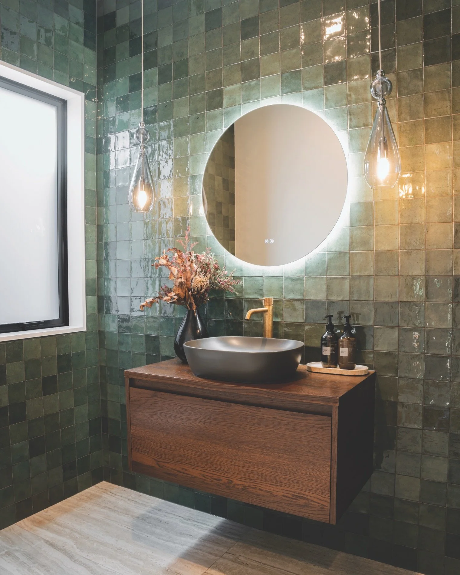
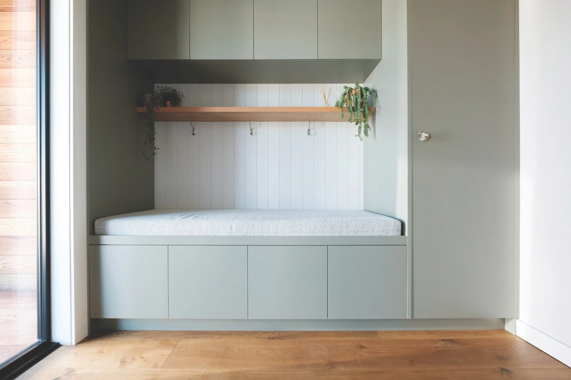
A colour I have loved for a while now is olive green. It’s one of my favourite colours so it’s been cool to see the olives and sages come through into interiors in paint colours, drapery and upholstery. I’ve also done quite
a few green kitchens. New Zealanders know how to reside with green. It’s just so calming, it celebrates our landscapes and it’s an easy colour to work with. I think it’s here to stay; it’s always going to have a place in our interiors.