Inside style
A new destination
Photography: Anna McLeod
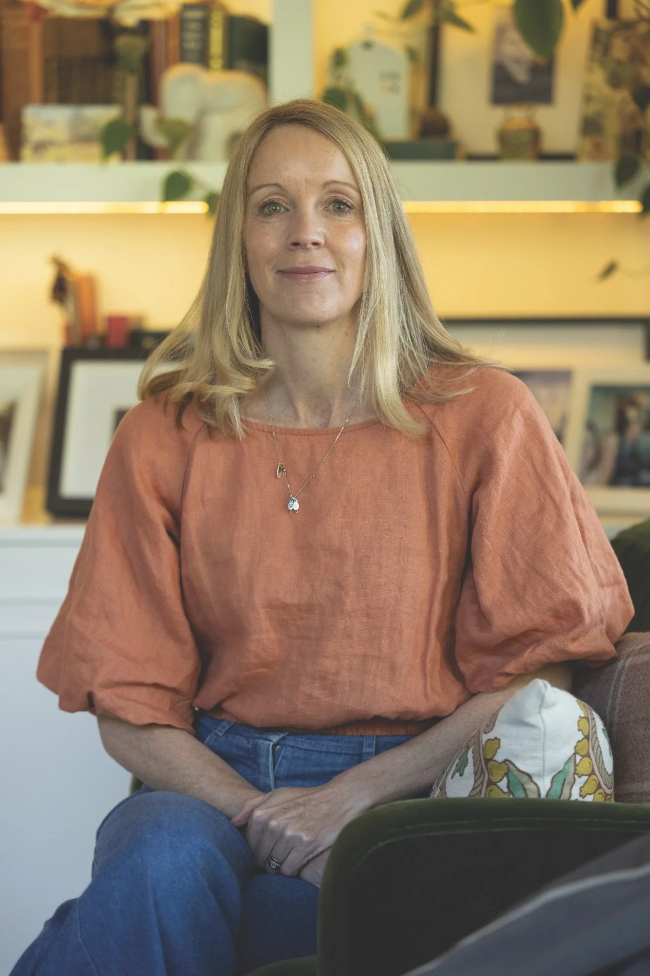
Interior designer Kath Preston of Two Birds Design in Ōtautahi Christchurch concocts an eye-catching Airbnb.
HOW DID YOU CREATE AN APPEALING AIRBNB SPACE?
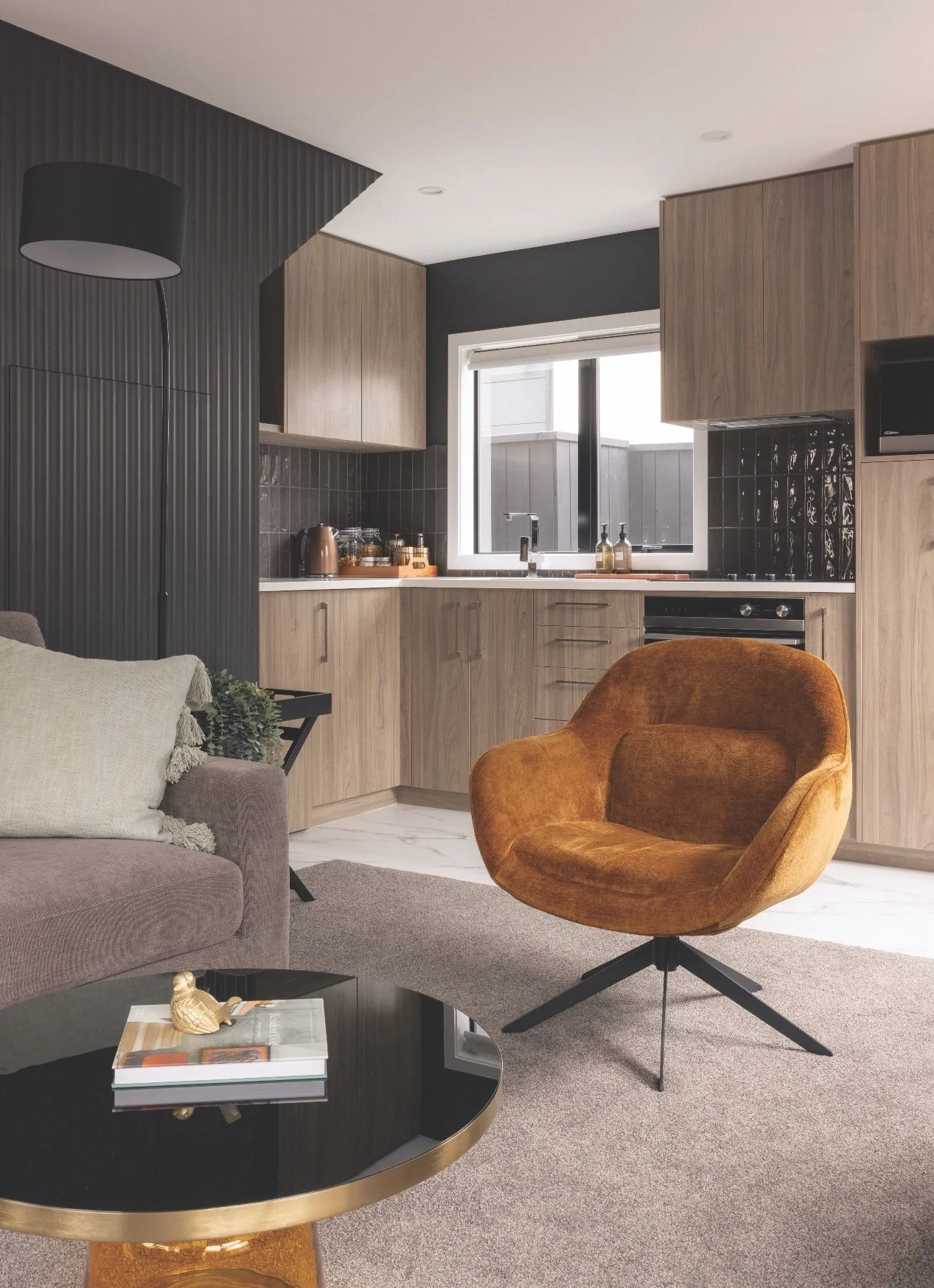
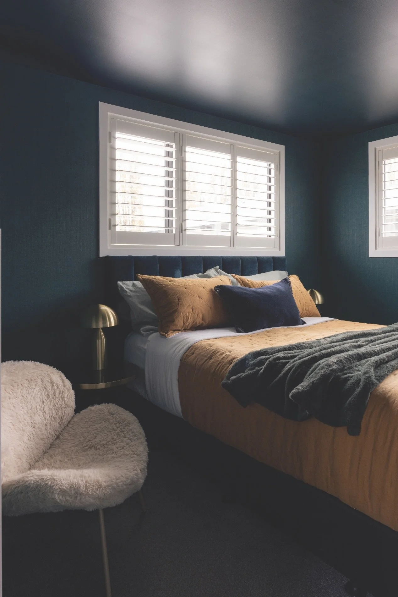
This project started as a stock-standard one-bedroom apartment in central Christchurch that I helped transform into a comfortable, character-filled Airbnb. The goal was to move away from the typical neutral rental aesthetic and instead create a space that feels memorable, warm and inviting for guests. By introducing layered colour, texture and moodier tones, we were able to give the apartment a boutique, hotel-like feel while still maintaining comfort and practicality for short-term stays.
HOW DID YOU FIND THE RIGHT VIBE?
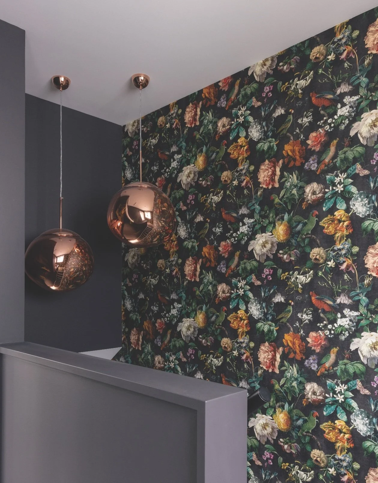
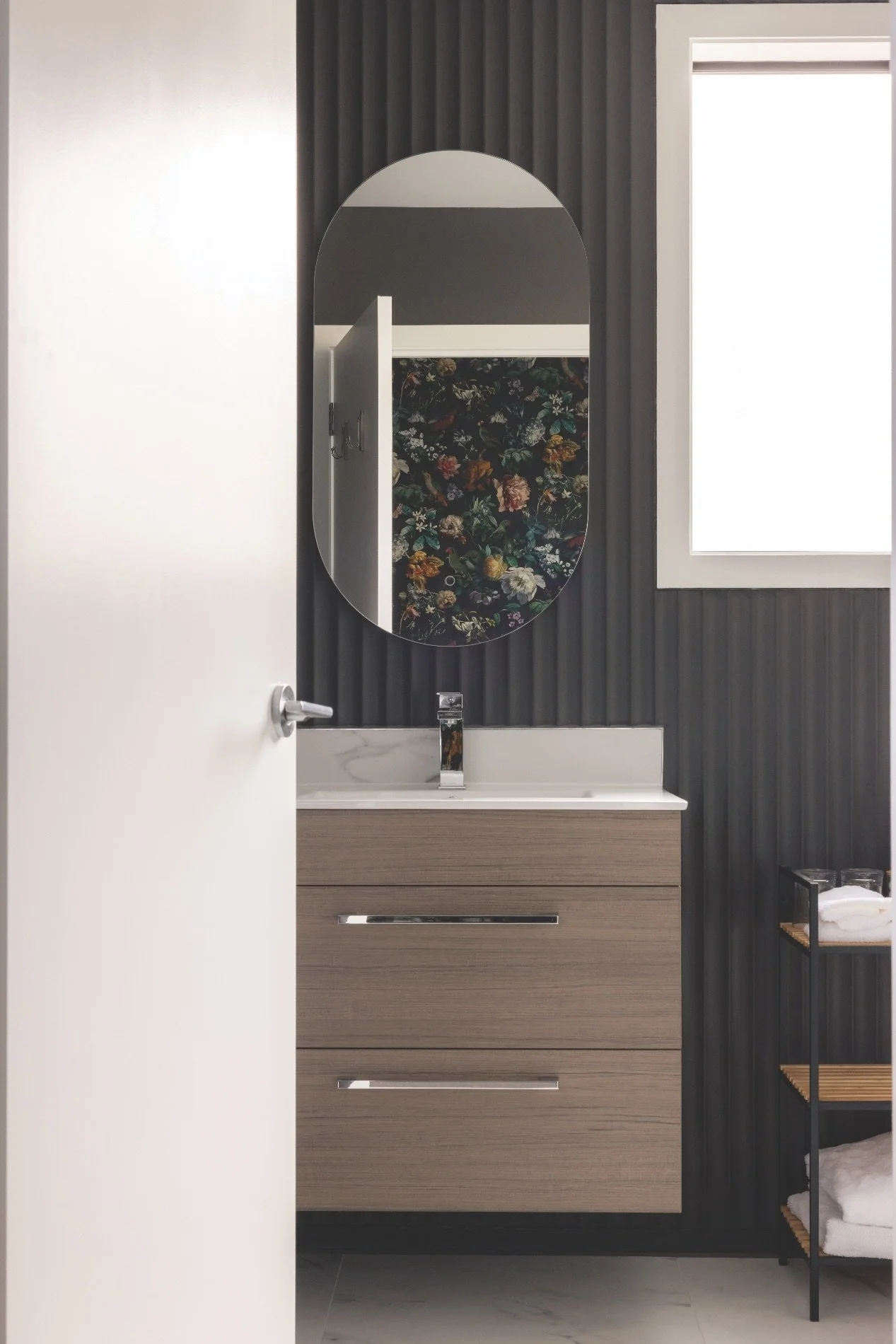
Colour and texture were essential tools in creating atmosphere within the apartment. I used dark, moody paint colours and wallpaper to add depth and visual interest throughout the space. I also added painted, textured, scallop-style panelling. Interestingly, there are no white walls in this apartment. Because the footprint is relatively small, we were able to commit to darker tones across the entire space without it feeling overwhelming. In a larger home I would usually balance these deeper tones with lighter walls or ceilings to provide contrast and breathing space, but in this apartment the consistent palette helped create a cohesive and immersive feel.
HOW CAN WE CREATE THIS LOOK FOR OURSELVES?
Many people default to safe neutrals, but deeper or more distinctive colours can add character and sophistication. That said, it’s important to consider light, scale and how colours connect between rooms. Testing samples on the wall and observing them throughout the day is always worthwhile, as natural light can significantly change how a colour reads. If you are hesitant to use too much colour, start by introducing it to your powder room or TV snug. Resene also has a fabulous selection of quality wallpapers that team nicely with its dark, moody paint colours and add texture and interest. Don’t be afraid to go bold. You can always paint over it! Nine times out of ten, the braver you go with your interiors, the more you end up loving the result.
WHAT COLOURS DO YOU RECOMMEND?
Colour is one of the most powerful tools in interior design because it completely shapes how a space feels. It can influence mood, define zones, highlight architectural details and create personality within a room. Paint, in particular, is also one of the most accessible and transformative design elements because it’s a relatively simple change that can dramatically shift the atmosphere of a space. I tend to gravitate towards rich, earthy tones like Resene Ironsand and Resene Bokara Grey as well as layered neutrals that create warmth and depth, such as various strengths of Resene Black White, Resene Rice Cake and Resene White Pointer. Deep greens and blues like Resene Midnight Moss and Resene Blue Bark, and charcoal tones and complex greys like the various strengths of Resene Masala are often favourites because they work beautifully with natural materials, including timber and stone, as well as with fabrics like linen, boucle and velvet. These colours also tend to age well and create a timeless base for styling. And more recently, I’ve been drawn to using deeper neutral colours in various strengths such as Resene Bison Hide and Resene Ash. The layering of these neutrals creates depth and interest, adds instant atmosphere and feels both modern and timeless.