Inside style
The new nostalgia
Supplied portrait image: The Press
Tiffany Anderson of Tiffany Anderson Design in Ōtautahi Christchurch adds soft charm to a character renovation.
DO YOU WORK WITH COLOUR A LOT?
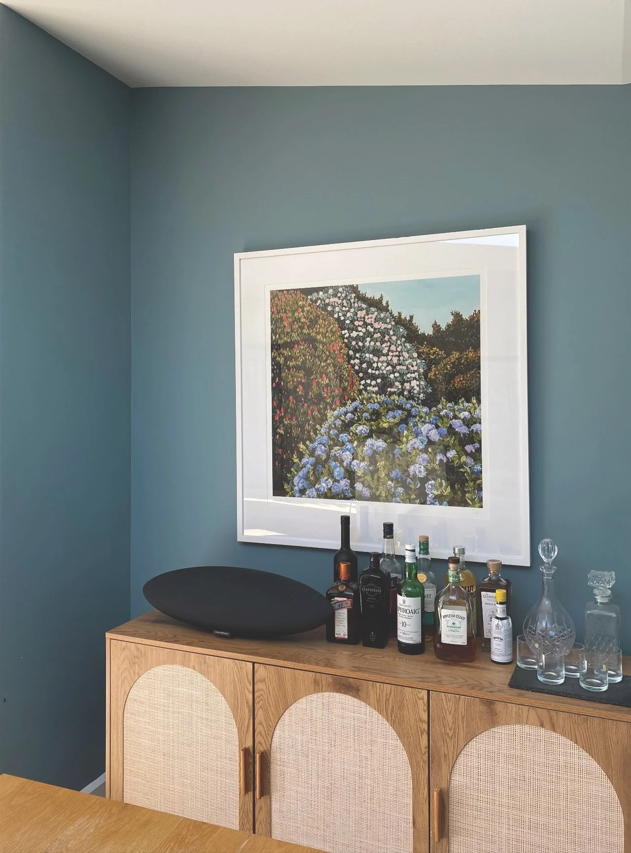
Yes, I use colour to define spaces and create atmosphere. Whether expressed through art, a beautiful fabric, wallpaper or paint, colour in design has the ability to shape mood and character. Often it begins with a single colour drawn from a favourite piece of art, then thoughtfully layered throughout the home to create a considered feel.
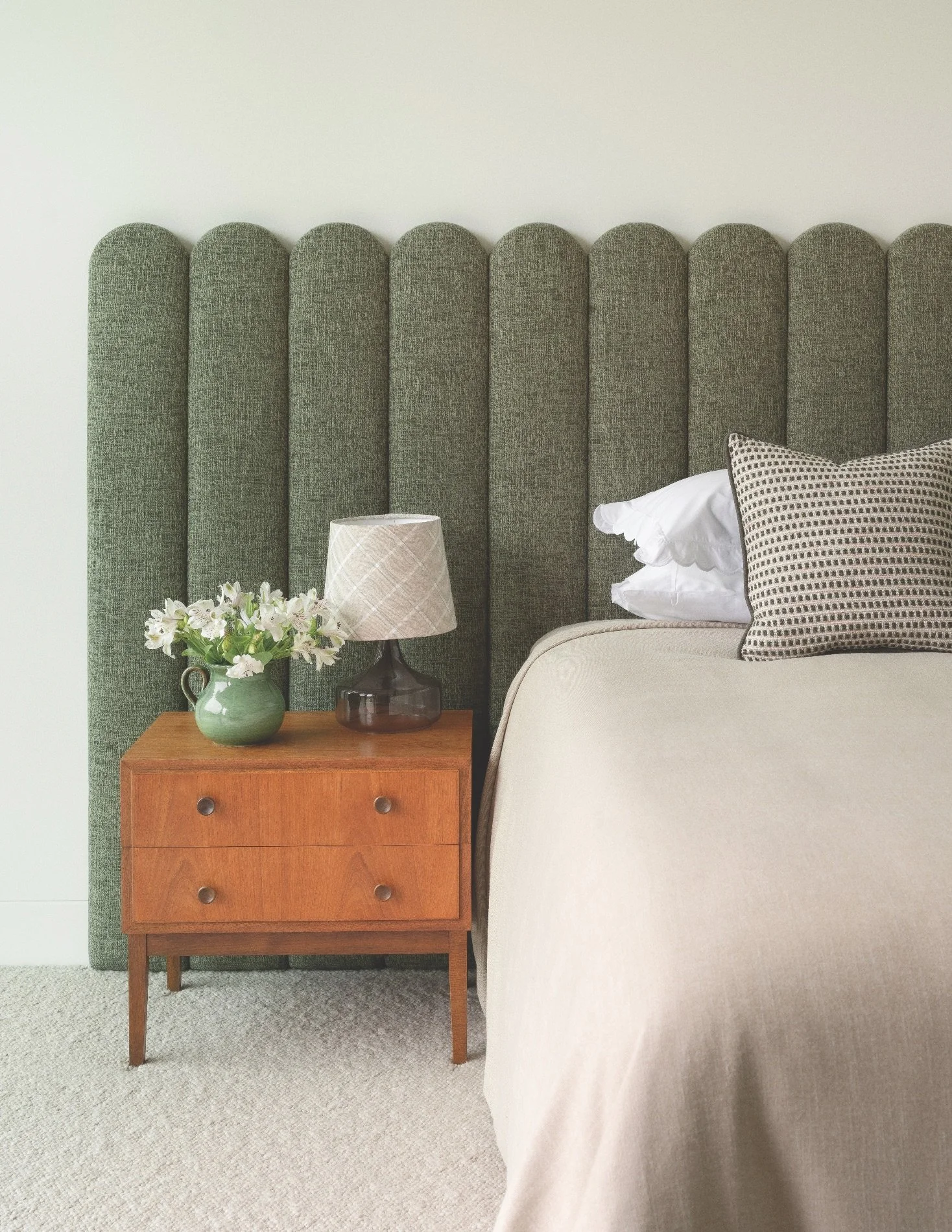
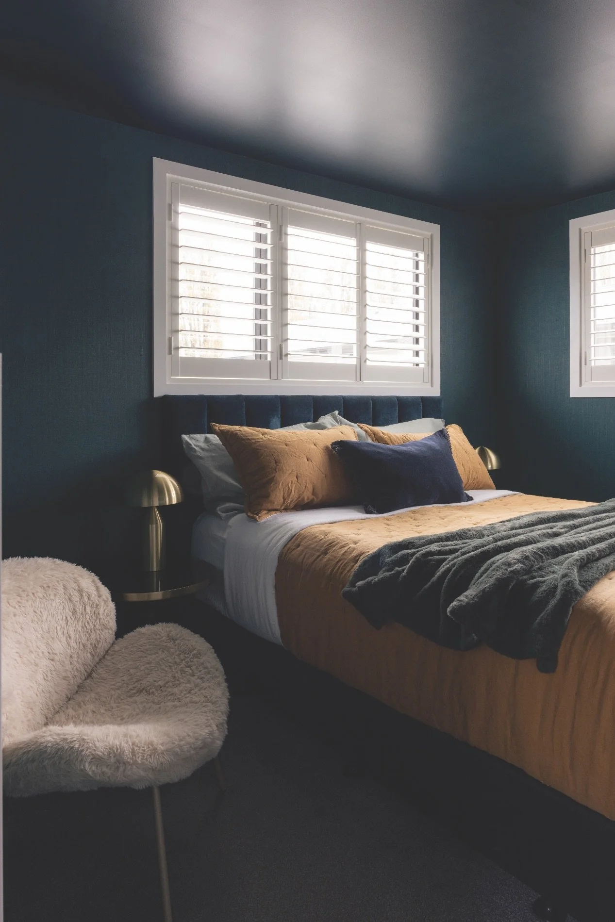
As many of the interiors I work on are new builds, the opportunity to work on a character home allowed for greater creative scope in embracing richer tones and highlighting spaces in a more expressive way. It helps to have homeownerswho are trusting and prepared to be bold!
WHAT DID YOU WORK ON IN THIS HOME?
This project was a renovation of a St Albans bungalow for a young family. I was mainly involved in colour selection forpaints and wallpapers. We used colours to define individual rooms, and wallpapers were used to balance the paint.
HOW DO YOU LIKE TO WORK WITH HOMEOWNERS?
I love to get to know my clients. I think it is important to develop a relationship, to get to know them and learn a little about how they live. I always start with a meeting to discuss the project and listen to their ideas. Often they have gotten quite far down the track with selecting colours and finishes, but just need steering in the right direction. And sometimes just a little reassurance gives them all the confidence they need to proceed.
WHAT ADVICE DO YOU GIVE?
Trust your instincts. Don’t be afraid to use depth or contrast: darker rooms often benefit from a darker colour. Embracing the lack of light rather than fighting it can create a more intimate, dramatic space.
WHAT COLOURS DO YOU LOVE?
It’s funny how colour finds a way in: colours we previously overlooked become favourites, possibly from trends and imagery we absorb without realising. I am loving Resene Field Day and Resene Eau de Nil at the moment. I have always been drawn to blue-based greens such as Resene Green Meets Blue, but equally love soft muted tones such as Resene Bone. I also like to use colours that are multi-pigmented, which are often cloudy or moody and will change throughout the day.
WHAT’S A FUN FACT ABOUT YOU?
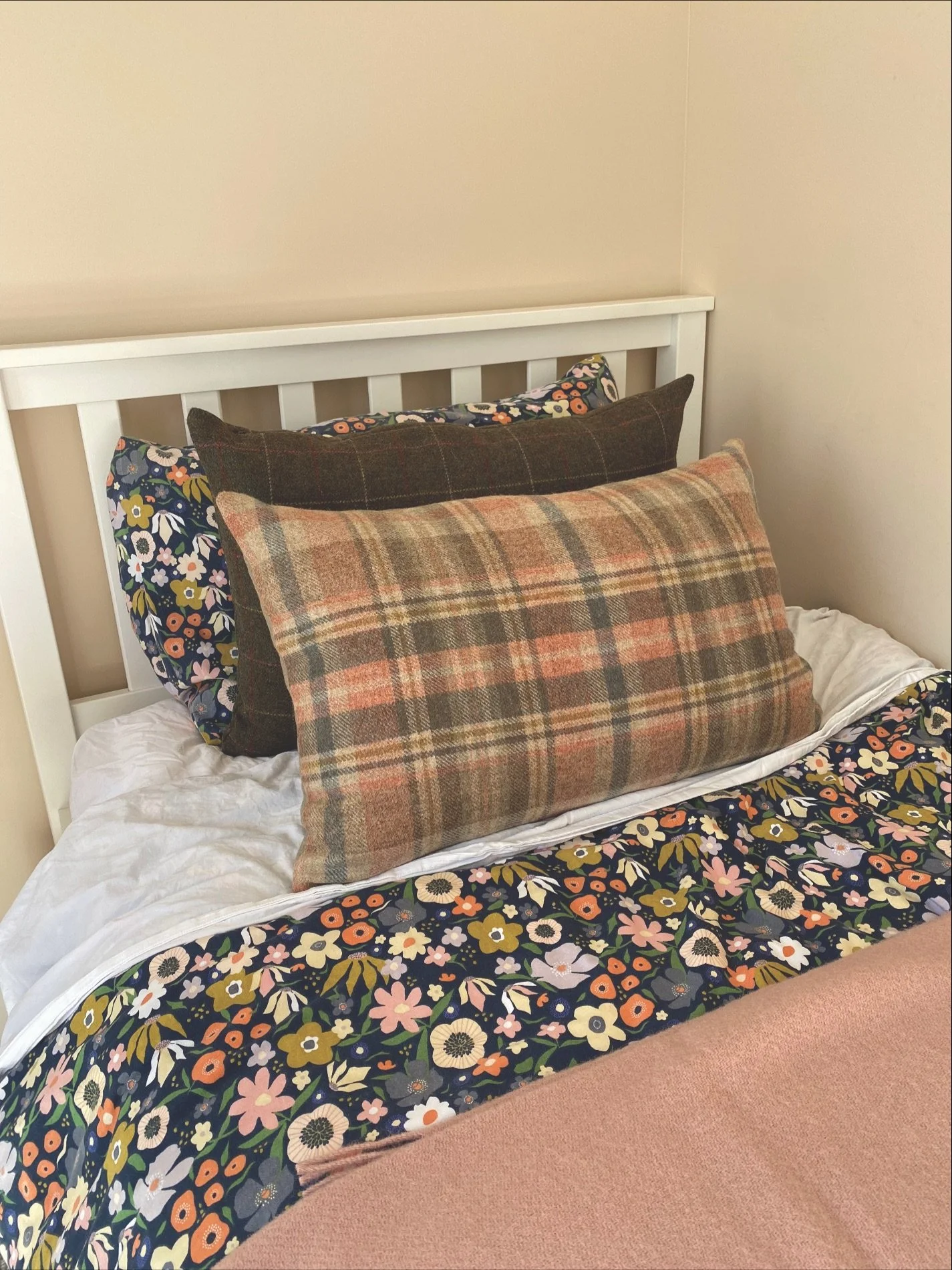
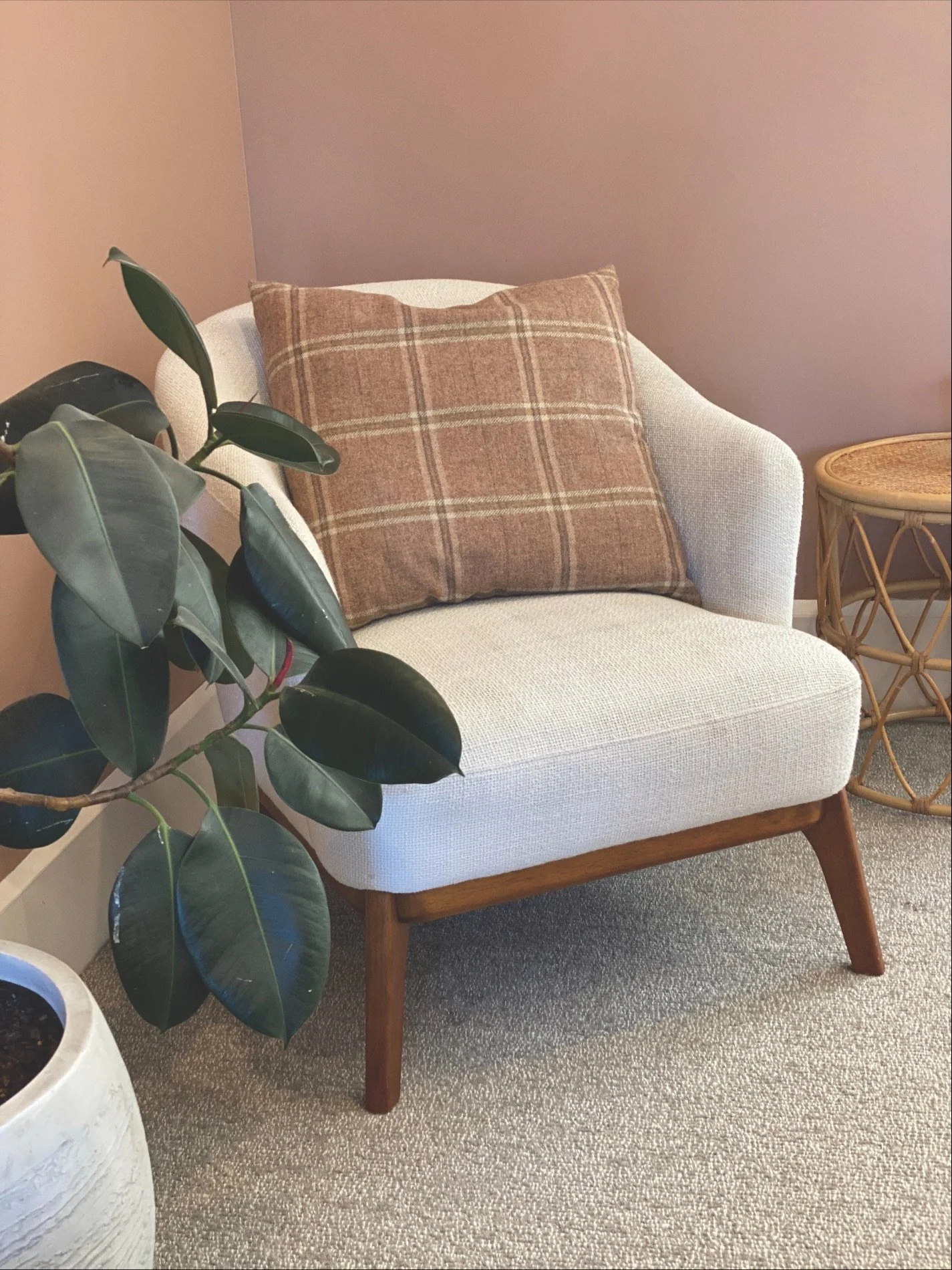
I have recently launched my own range of interior wool products, including cushions, footstools, lampshades and throws. Wool fabrics have those gentle, muted tones that look effortless and lived in. These colours sit well in my interiors,whether they are in a modern or more traditional home, and I love incorporating them into a scheme as a finishing touch.