Inside style
Setting the tone
Photography: Rosa Veale Woods
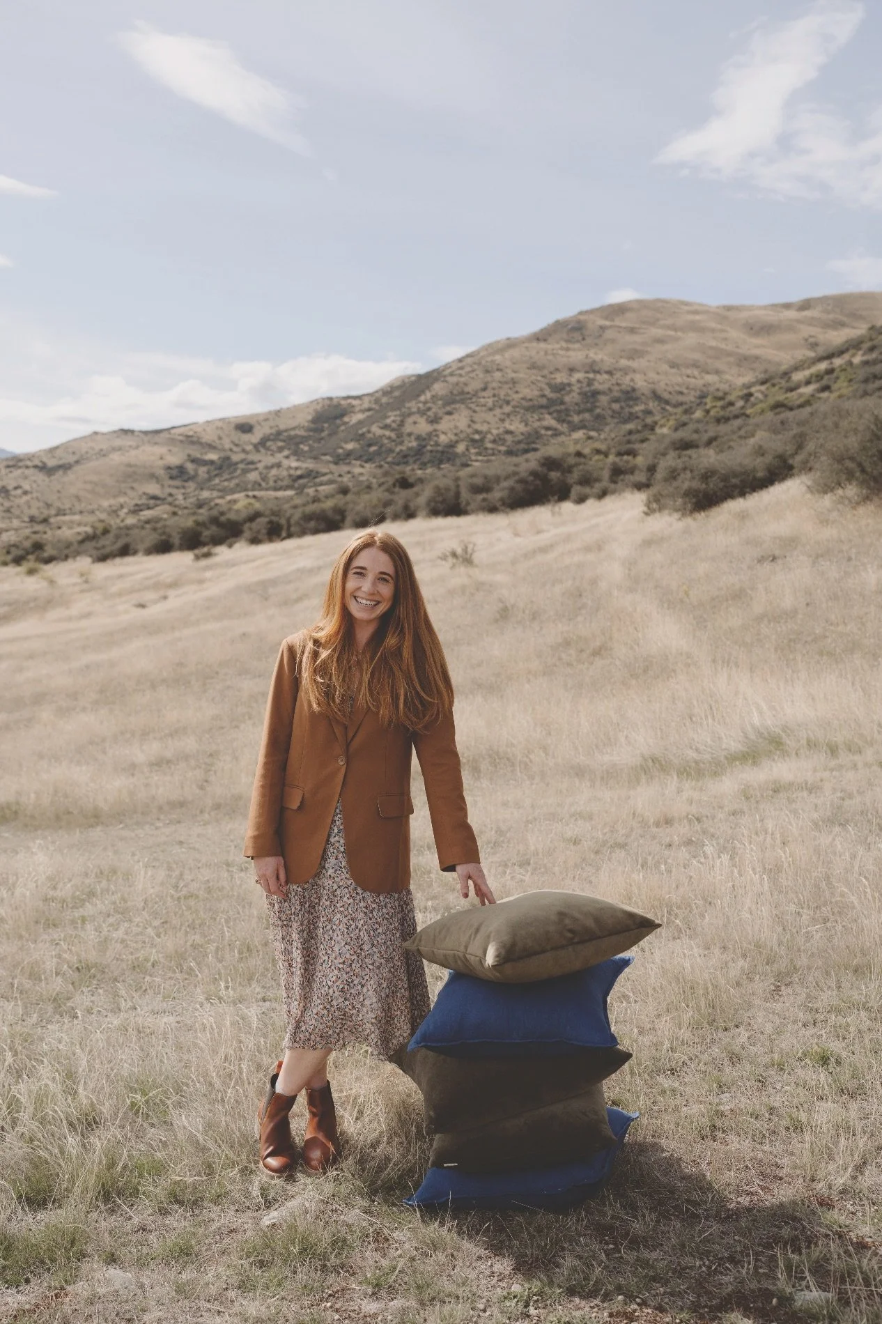
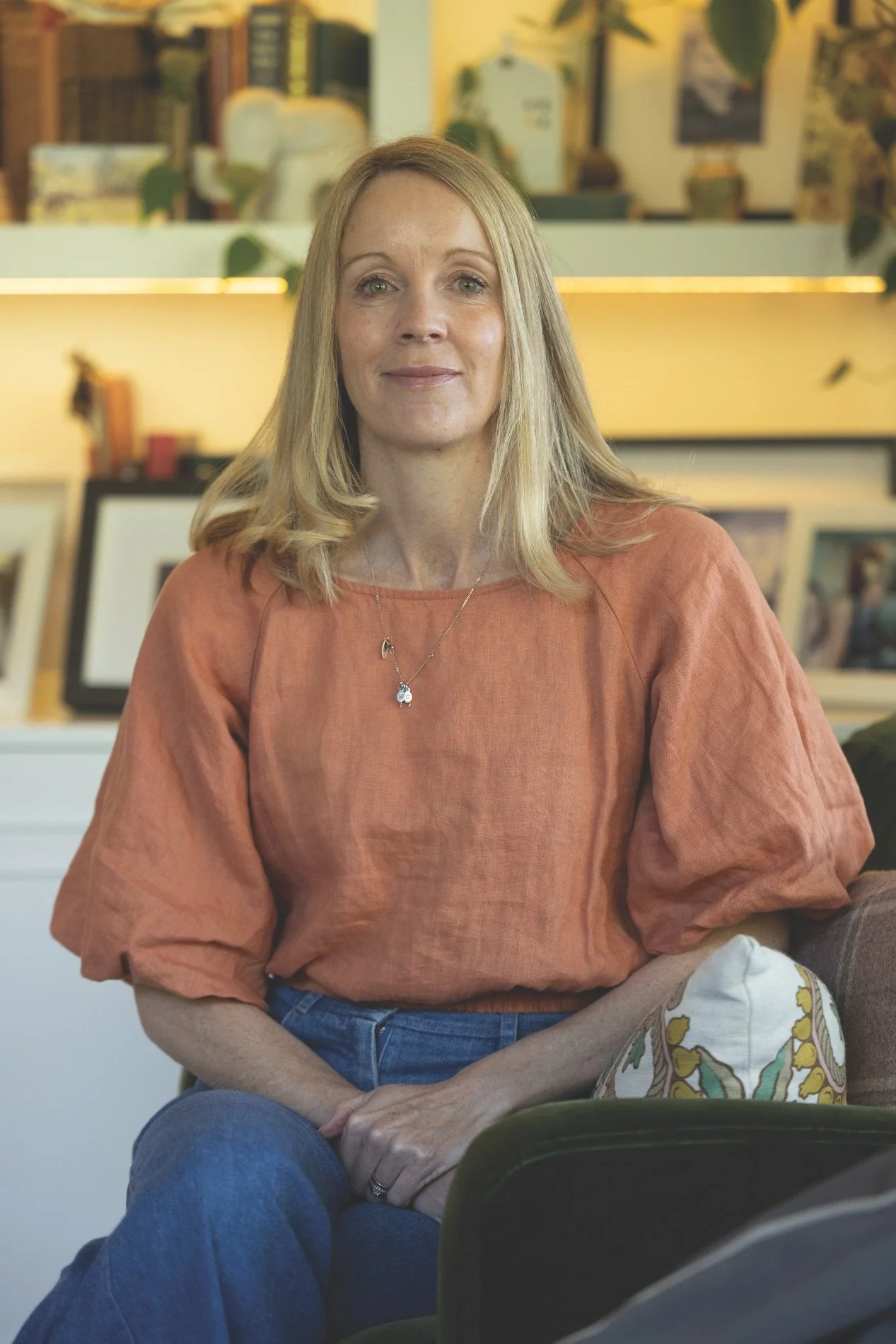
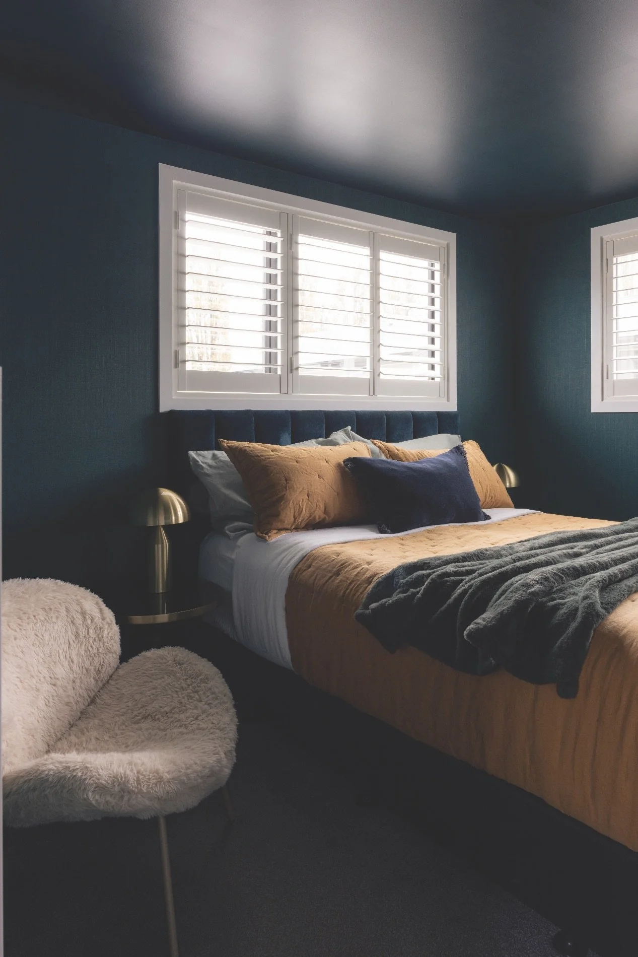
Jess Blair, creative lead of Forager Studio in Queenstown, wraps her own home in layers of warm colour.
WHAT WERE YOUR AIMS WHEN DESIGNING YOUR HOME?
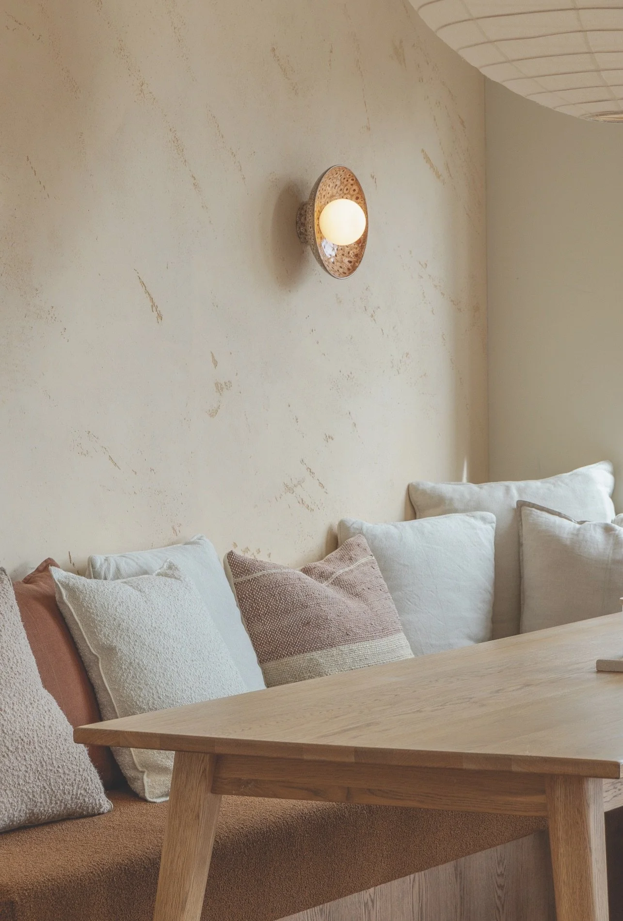
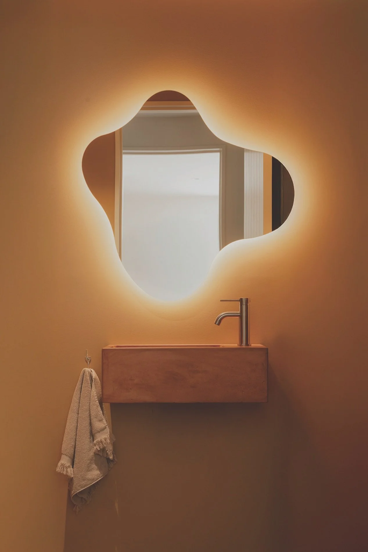
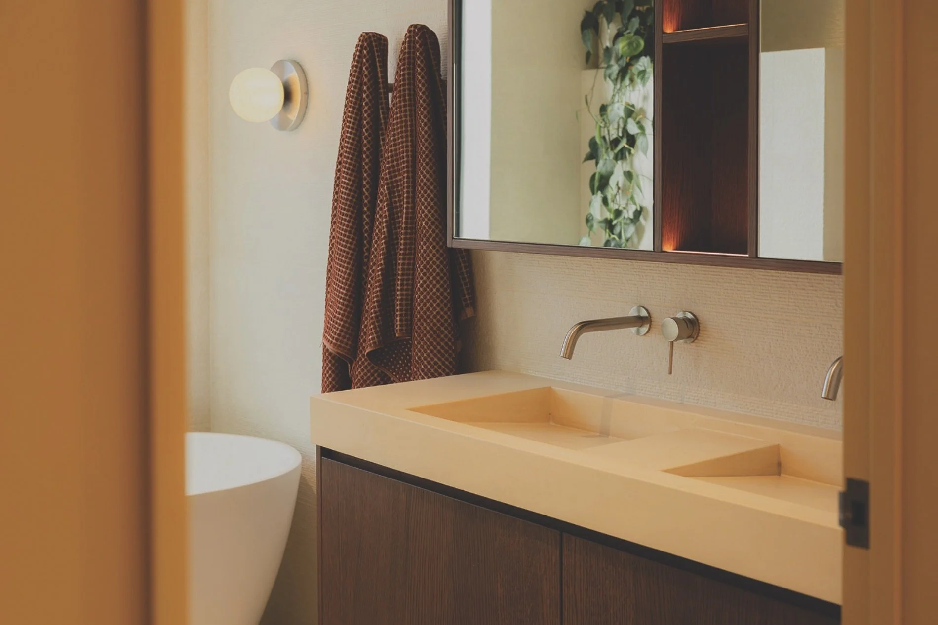
This is the home my partner Jon and I designed and built together. It's our sanctuary: a place of rest at the end of a long day, and a space to host friends and family. We wanted the home to feel like a relaxed holiday retreat, layered with timeless selections that feel as though they’ve always belonged here, despite it being a new build. The intention was to create warmth and familiarity from the outset ; a home that feels grounded, welcoming and deeply personal. Colour weaves subtly throughout the house in varying intensities. In some spaces, such as the master suite, we embraced bolder paint schemes and colour drenching to create a cocooning effect. In more permanent elements – such as concrete vanity counters, plaster finishes and tiling – we opted for softer, retrained tones that will age gracefully over time. The balance between expressive and enduring was important to us.
WHAT DOES COLOUR MEAN TO YOU?
My background is in hospitality design, where colour is embraced as a powerful tool to shape atmosphere and mood. It has the ability to influence how a space feels almost immediately. Whether energising, calming or grounding, colour sets the emotional tone of a room. That philosophy underpins my residential work – I believe a home should evoke the same curated, sensory experience as your favourite cafe, restaurant or spa. The atmosphere should feel intentional, immersive and restorative.
ANY GOOD TIPS FOR US?
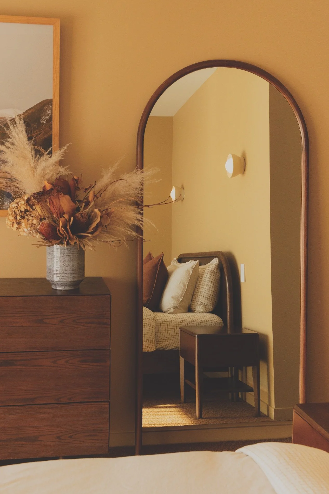
Colour gains strength through layering. Complementary tones, subtle shifts and different strengths of the same hue can bring real depth to a space. This might mean selecting a paint shade you love and using both a full and half strength within the same room, or carrying that tone through into textiles such as carpet, bedding or curtains. Layering creates richness and cohesion.
WHAT ARE YOU LOVING RIGHT NOW?
I’m naturally drawn to tones found in the landscape, such as warm clay hues paired with soft sage or turquoise blues. The warmer shades ground a space and create depth, while the blues bring a calming energy. When working with clients I look for cues in their surroundings, the architecture, their artwork or the stories they share about their lives. The aim is always to curate a palette that feels deeply personal and authentic to them. I’ve also been noticing beautiful shades of lilac, violet and burgundy emerging recently. There’s a softness and depth to these tones that feels expressive yet sophisticated. I’m excited to see how people begin to interpret and layer them into their spaces.