Inside style
Creating a classic
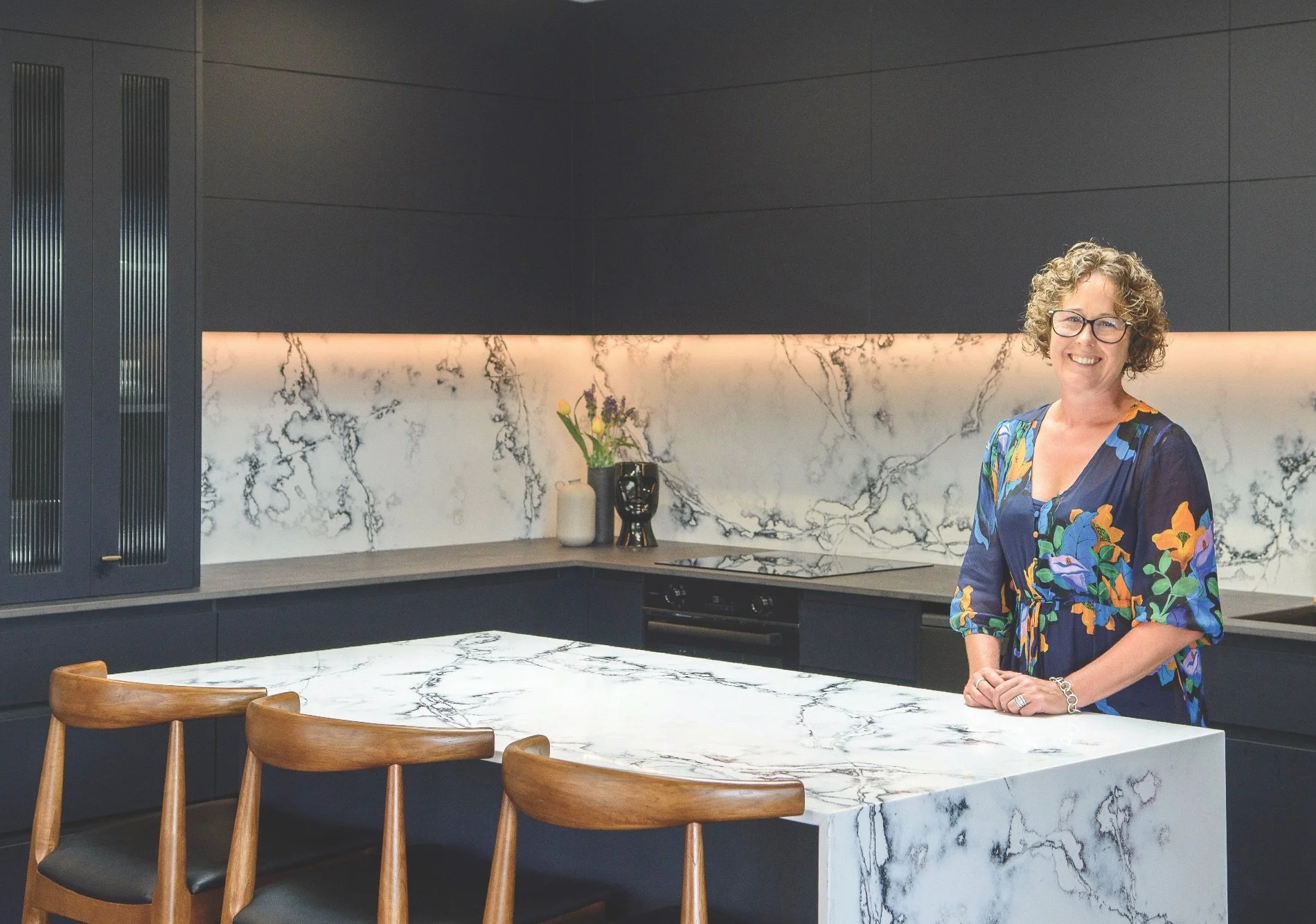
For her own mother’s new home, interior designer Lynley Hansen of By Design Interiors built on the elegance and sophistication of navy blue.
TELL US ABOUT THIS SPECIAL PROJECT.
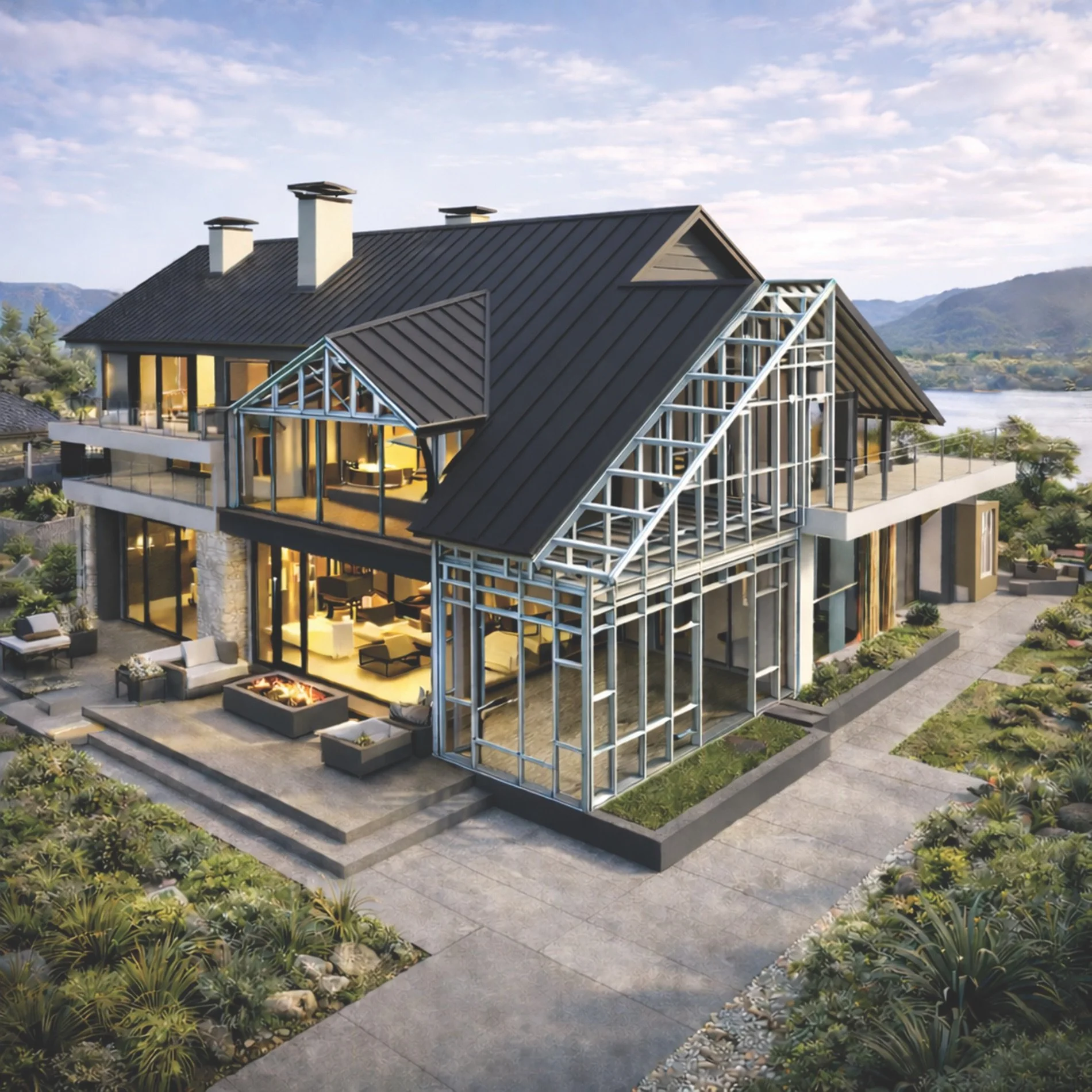
This home is incredibly personal. It’s my mum Anne’s home, built with Hann Construction in the Te Whāriki development in Lincoln, Ōtautahi. Set in a quiet cul-de- sac and backing onto a reserve with a pond, her spot has become a natural meeting place for neighbours exploring the walking tracks. It’s close to the city but immersed in the landscape, so it feels connected yet private.
DO YOU HAVE A FAVOURITE ROOM?
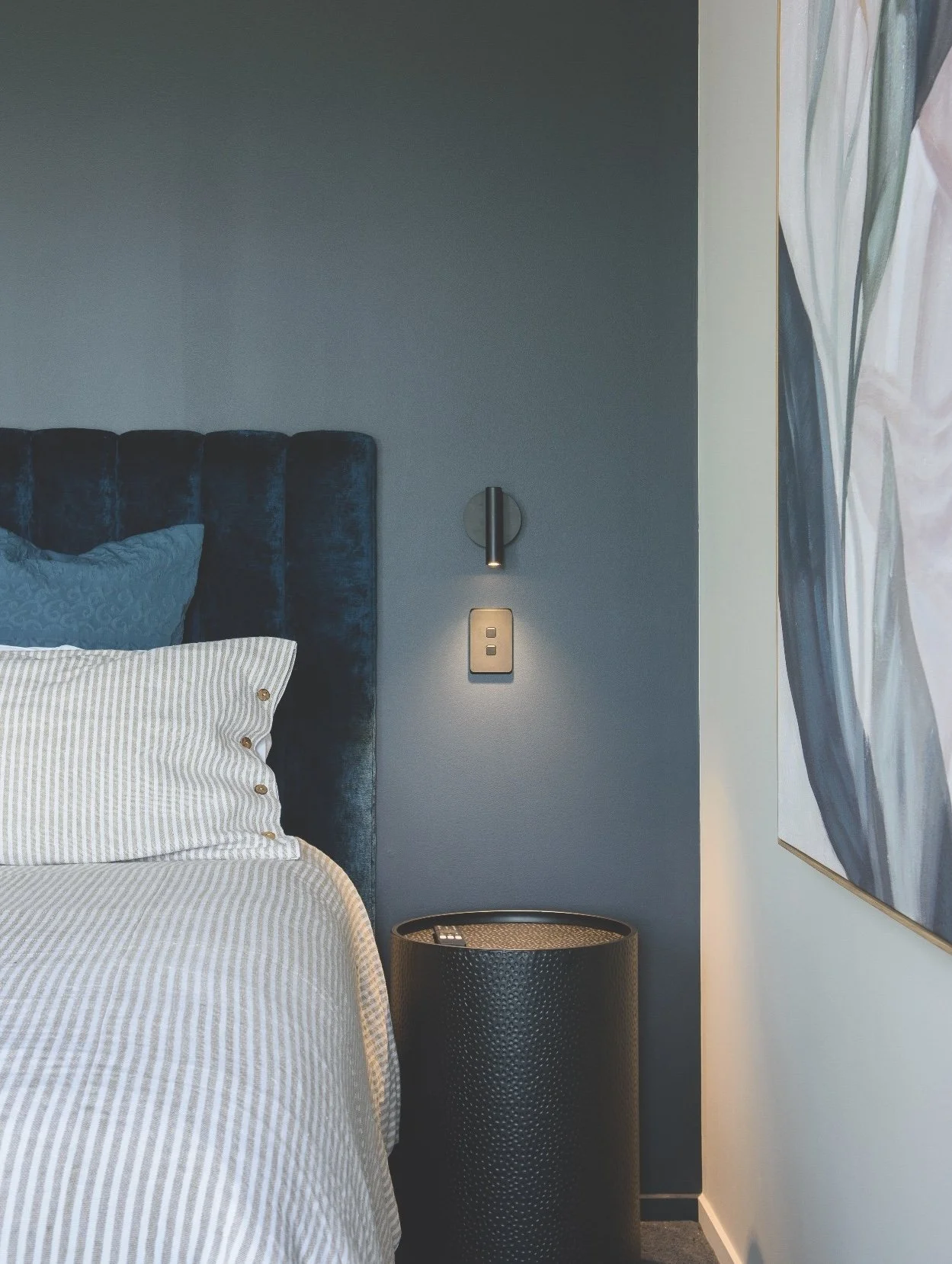
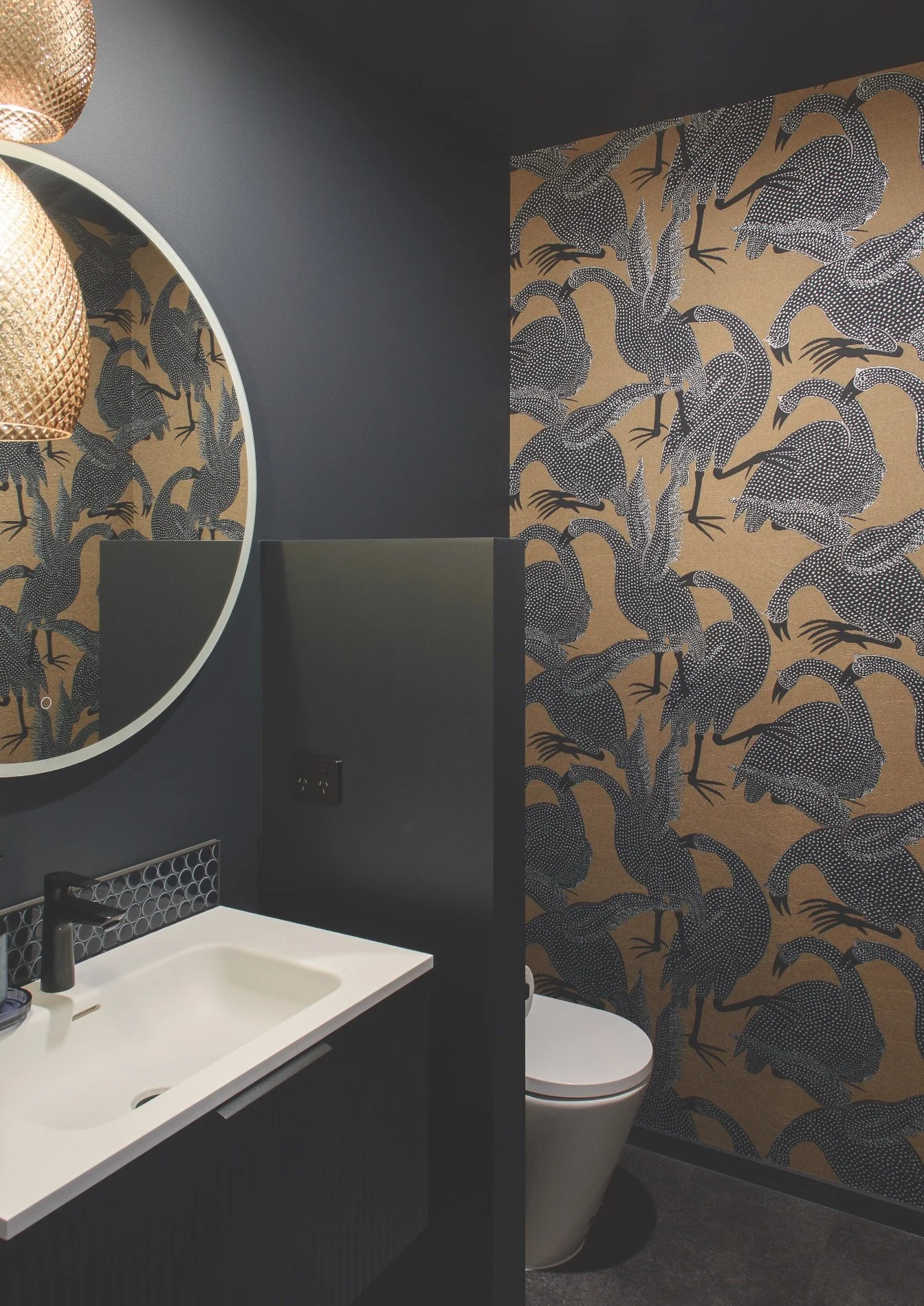
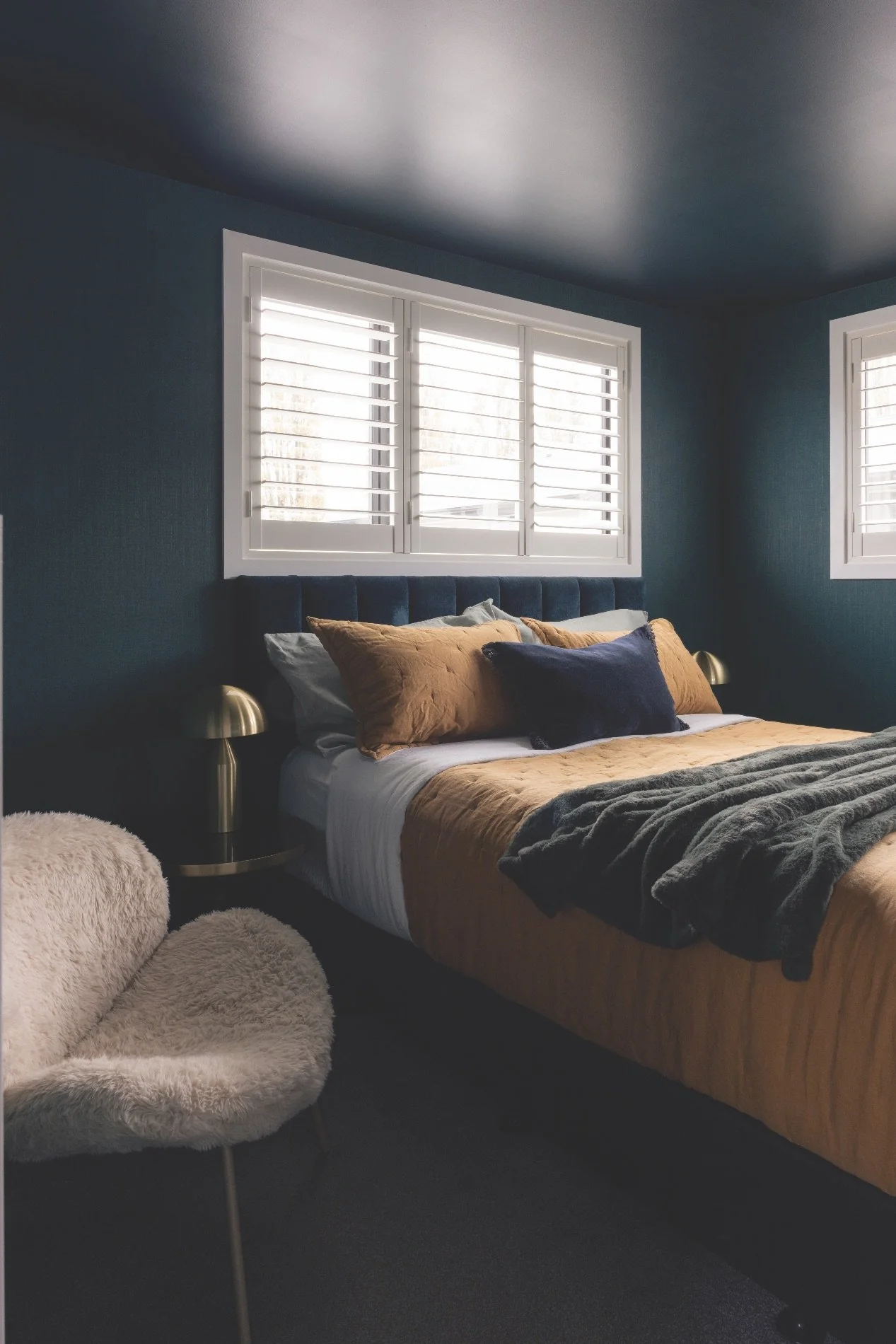
I worked closely with the architect to position the master suite so Anne could wake to views across the Port Hills and watch the sunrise from bed. We joked early on that electric blinds were essential, and we did indeed install electric sunscreen blinds and curtain tracks throughout. Beyond convenience, they serve a practical purpose, protecting furnishings and the carpet from harsh UV light while maintaining softness and privacy. The ensuite was designed as a boutique retreat. It’s fully tiled, with the bath positioned to capture the outlook. Every material, every finish, every colour was carefully selected with Anne in mind.
HOW DID YOU CHOOSE THE COLOURS?
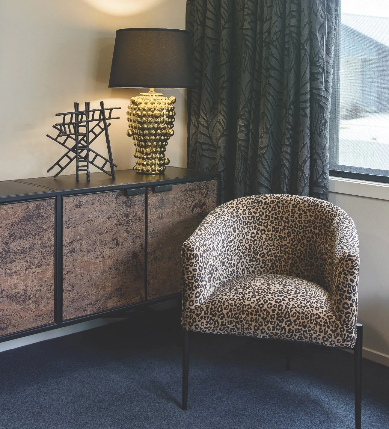
Anne’s love of navy guided the palette. It’s a colour that feels confident but thoughtful, and it became our grounding tone throughout. The deep navy wool carpet adds richness and depth, and we chose cabinetry and accents to echo that strength. To soften and balance it, we added warm neutrals inspired by the Canterbury Plains – golden grasses, soft fawn undertones and dusted neutrals – layered with texture for a sense of luxury. We were also inspired by the more immediate surroundings. The greens of the reserve, the reflections off the pond and the golden sunrise were all influences.
AND WHY IS COLOUR SO IMPORTANT?
For me, colour is about emotion, reflective of the people living in a space, and is one of the most powerful design tools we have. When used intentionally, it elevates every other element. Colour in this home was about warmth, depth and personality. The main living areas are in Resene Quarter Napa, a soft neutral that sits beautifully in natural light and is calm without feeling flat. Doors were taken slightly deeper in Resene Quarter Craigieburn, adding subtle, cohesive definition. Ceilings were finished in Resene Milk White, keeping the spaces feeling fresh and light. In the powder room, a playful wallpaper was paired with Resene Double Cod Grey for a more dramatic statement.
WHAT’S YOUR BEST PAINT ADVICE?
Always test large samples, not small swatches. Never choose paint in isolation; it must relate to flooring, joinery and tiles. Don’t shy away from darker tones; they can feel cocooning and sophisticated. And most importantly, choose colours that reflect you, not just current trends. The end result will be a home that feels layered and refined, meant to be lived in and loved for years to come.