Inside style
Bowled over
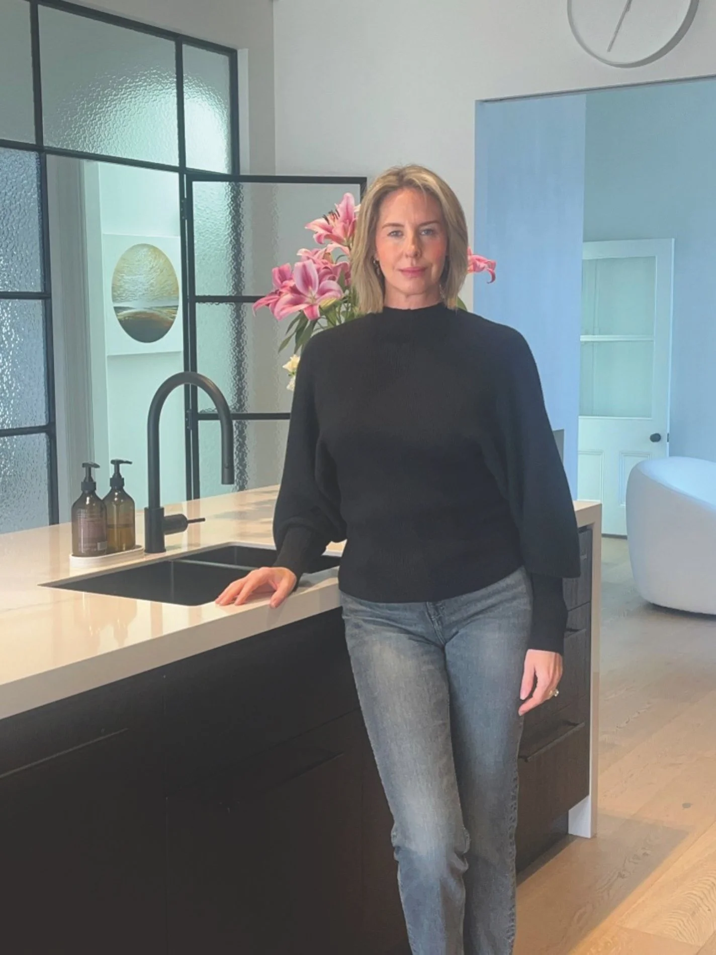
Pippa Burnett of Pippa Burnett Interiors, in collaboration with James Patterson from Walker Architecture, puts colour into action at Elmwood Park Bowling Club in Christchurch.
TELL US ABOUT THIS FUN PROJECT.
I had the absolute pleasure of being asked to work with Walker Architecture and their director of architecture, James Patterson, on bringing the Elmwood Park Bowling Club into its modern era with a brand new clubhouse. Given the history of this much-loved Christchurch club, we wanted to retain the sporting essence it has long held, as well as inject some personality by using some colours it has never had before. I worked closely with James, selecting paint colours and tiles while he progressed designs for the bar joinery, entrance display and feature ceiling.
HOW HAVE YOU USED COLOUR HERE?
Colour is a way to define spaces and add dimension to rooms that could be seen as flat or, dare I say, boring. This project features two club rooms that can be combined into a single, large space, or separated as needed, each retaining its own personality and functionality. Resene Black White was used on the walls of the smaller room, which is used for club days. In the bigger room, for large tournaments and gatherings, I used Resene Fuscous Grey. The bar is a huge feature that is positioned in the middle of those two areas. I wanted it to stand out without being the sole reason for members to be there – after all, they are there to play bowls! A rust-coloured mosaic finger tile was used on the curved wall bar area, adding just enough punch so as not to overpower the timber ceiling. Plus, it works well with the charcoal- coloured carpet.
WHAT’S YOUR BEST ADVICE ON MASTERING COLOURS?
Colour can be really scary, even to me. Creating spaces that will hold their longevity, possibly for decades, is something all of us strive for. Using the environment around you is a great way to put that plan into place. For example, I knew that the enormous bowling green with its vibrant year-round colour would dictate the colours I chose for the interior. To be a bit playful, Resene Midwinter Mist and Resene Jurassic were used for the female and male bathrooms to have a little follow-through in the interiors – but not be too much of a matching bright green that it would look predictable.
When you start the design process you will always have initial ideas that are your tried-and-true colourways. What I try to do is keep one or two wild-card colours up my sleeve. I always have a voice inside my head asking me, “Can we push this boat out further? Is there any way we can make this scheme more interesting?” And using the wild-card method has worked for me.
WHAT ARE YOUR TRIED-AND-TRUES?
Resene Black White is a fantastic all- rounder. It’s neutral and never throws an icy cold shadow. If, on the other hand, you are looking for a warmer neutral, then the Albescent White range is a good one as well.
AND ANY NEW FAVOURITES?
I am a stickler for warm, earthy tones. Brown colourways are now making space for deep plum reds like Resene Lonestar and Resene Pohutukawa. These colours remind me of my own environment at home, where I look out my window to the garden and see the Japanese maple trees – vibrant but not too bold. It’s a great balance.