Inside style
Anything but white
Jen Howell of Orange Door Interior Design brings earthy 1970s vibes to an extensive renovation.
TELL US ABOUT THIS PROJECT.
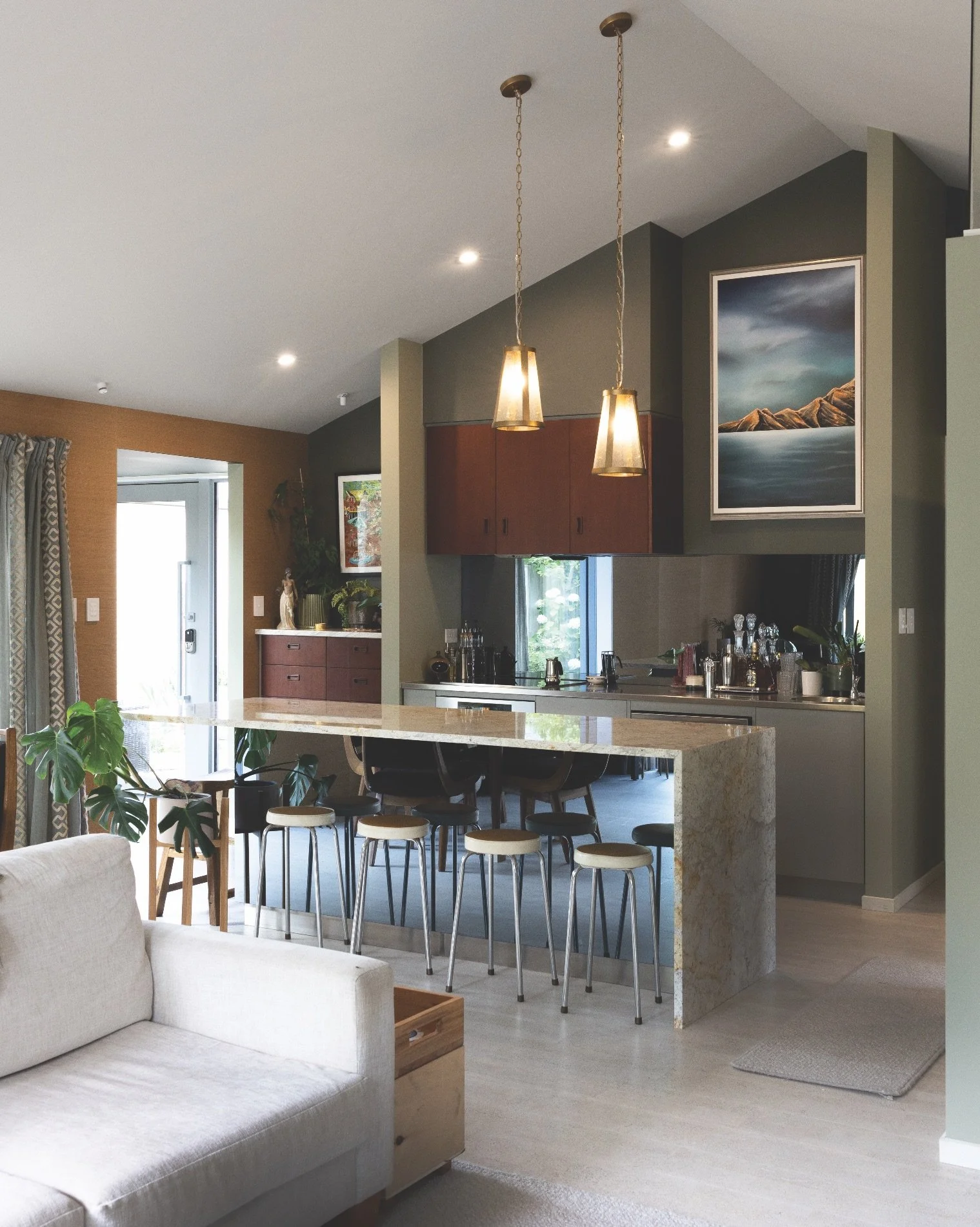
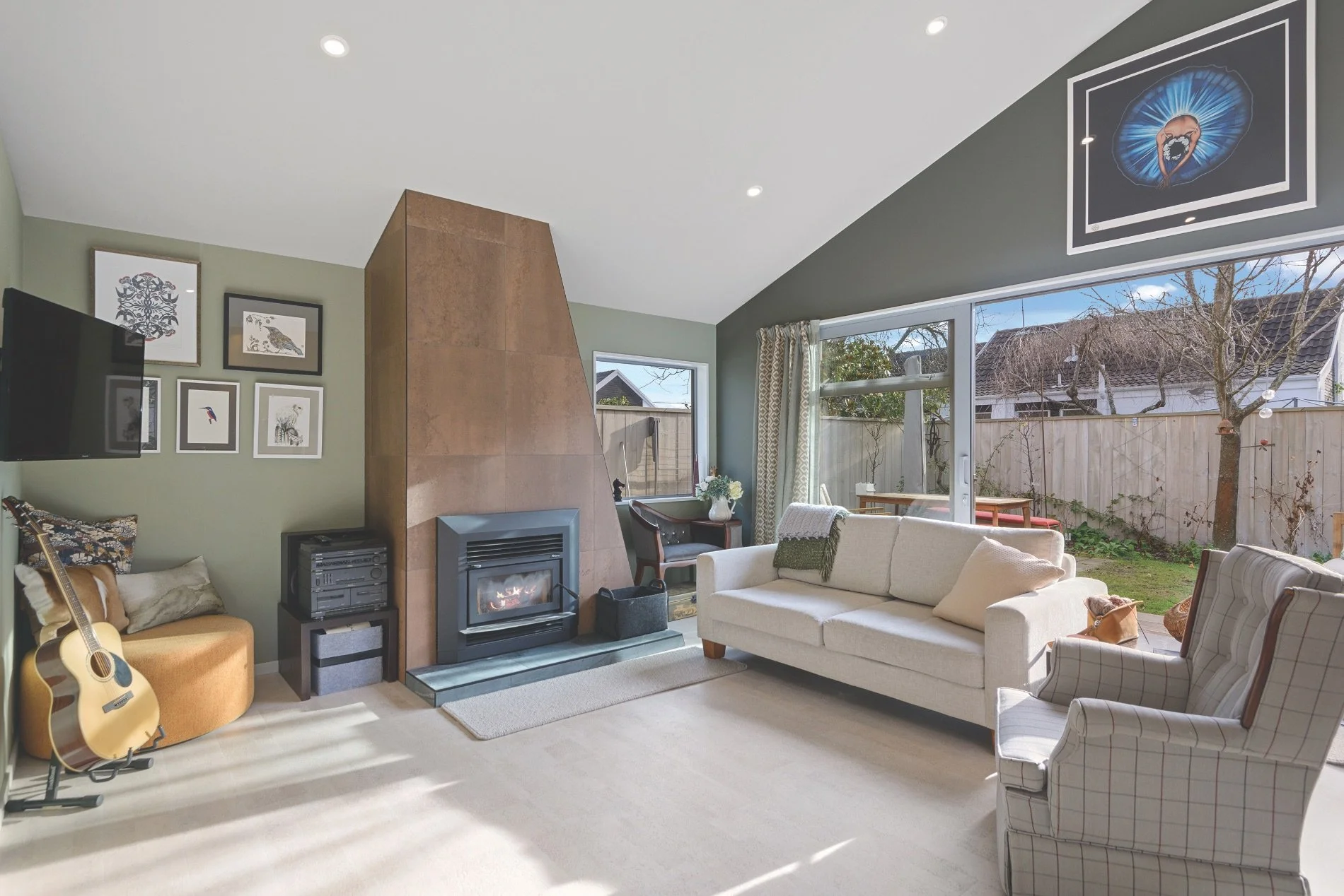
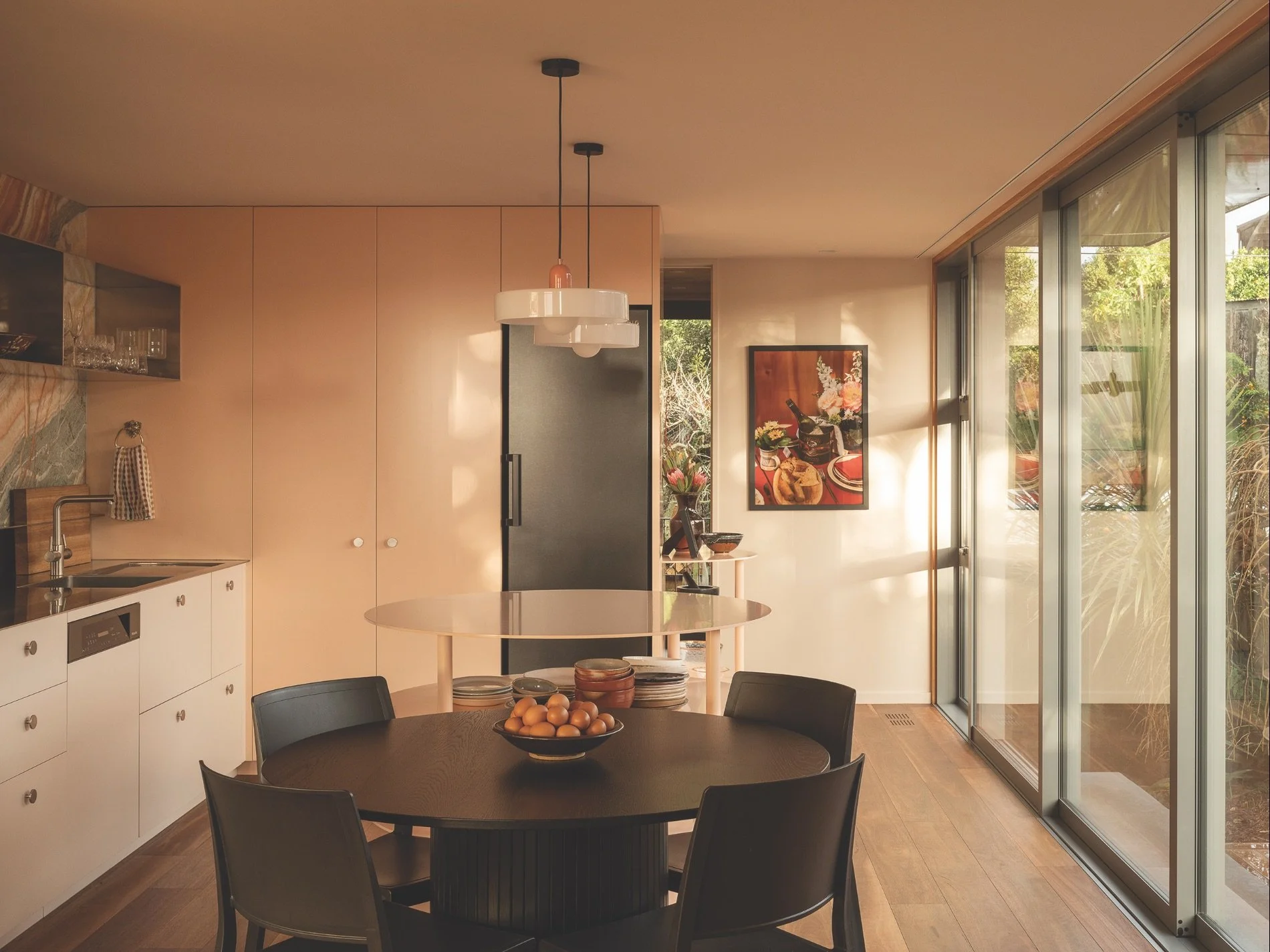
This was a major renovation of a late 1970s townhouse, maximising and opening up the living space while modernising it, yet keeping a nod to 70s colours and design elements by layering lots of texture with colour.
WHAT WAS YOUR APPROACH?
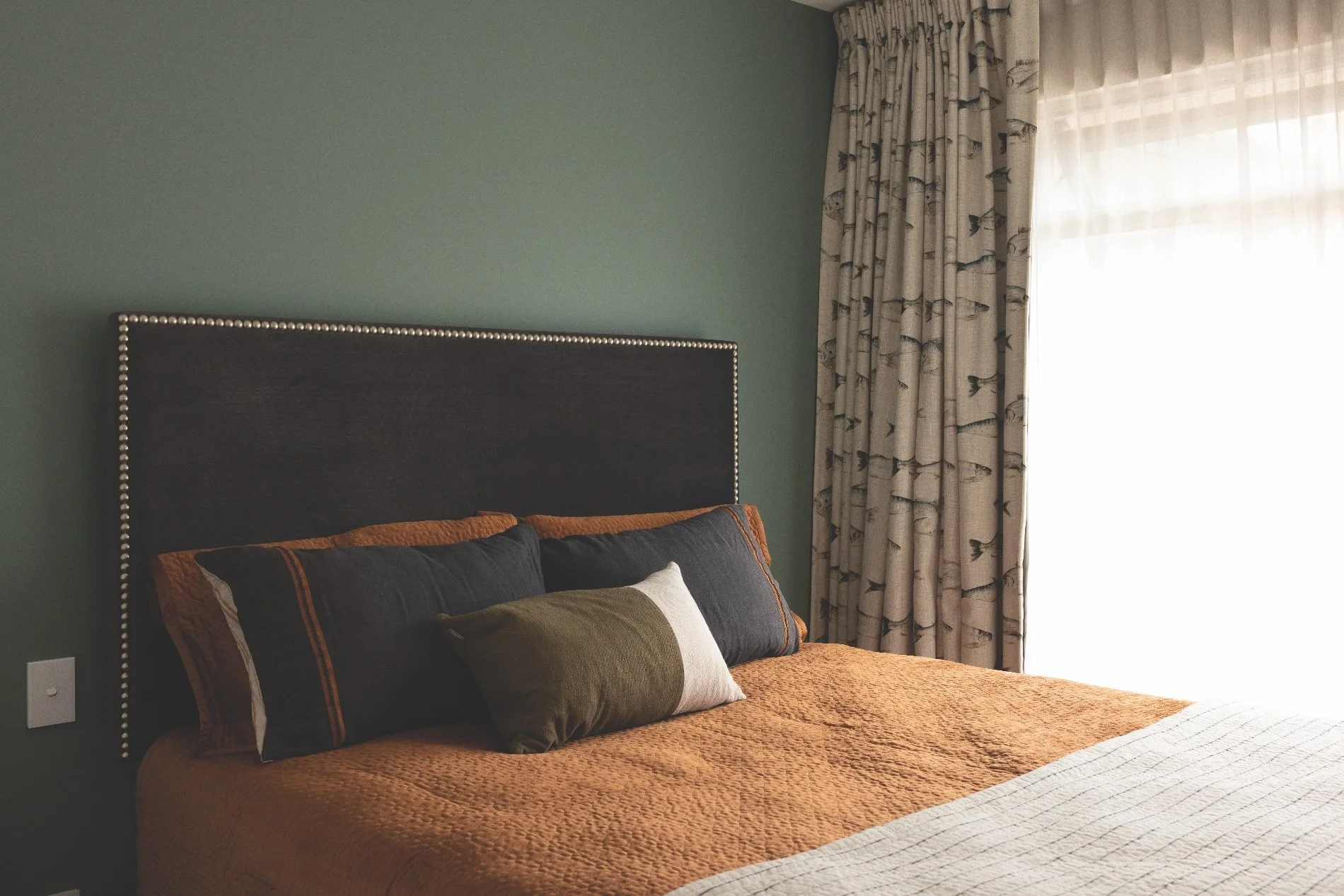
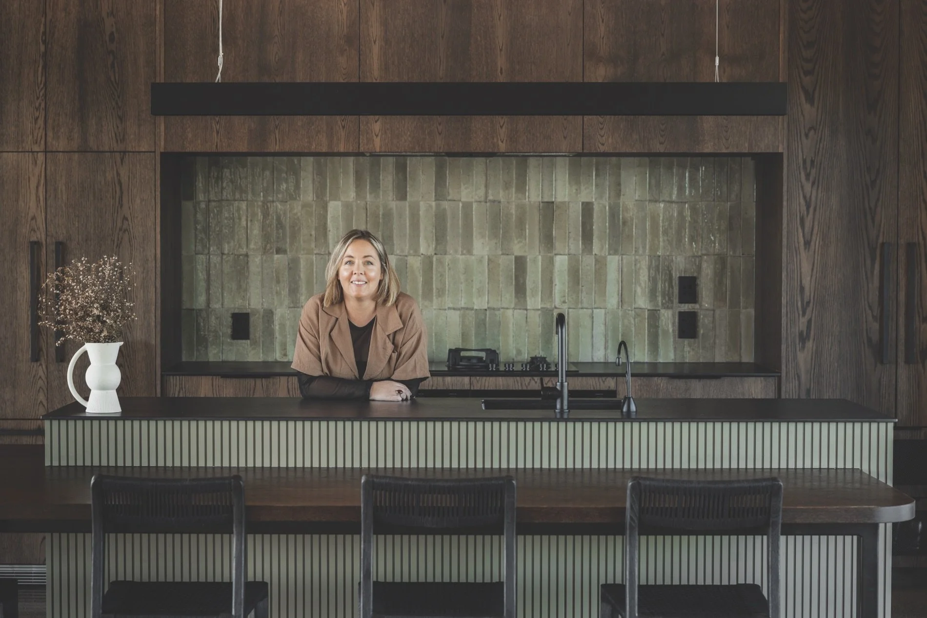
My client’s brief was, “Anything but white, with a lot of texture and interest,” so we settled on two shades of green for the living/ dining/kitchen pavilion, with a lovely, rich gold seagrass wallpaper feature wall, and soft beige for the pitched ceiling to mirror the whitewashed cork flooring. The mostly glazed entry area features more of the seagrass wallpaper on the only wall, and the ceiling is painted a deep liquorice green to mimic the slate flooring, tying in with the living area. We pulled terracotta tones from the granite benchtop to tile the asymmetrical chimney breast, and the client repurposed original mahogany cabinetry from a 60s kitchen she found on TradeMe to bring in the warmth of wood grain. The bedrooms each have their own flavour, with wall colour being pulled from beautiful patterned fabrics and wallpapers to create a story.
WHY IS COLOUR AN IMPORTANT ASPECT OF DESIGN?
Walls and ceilings are some of the largest visual surfaces in a space, so it’s a great opportunity to choose a colour that will set the tone of the space and how we feel when we are in it. Wall colour can help us tie together other aspects of the room, such as flooring, cabinetry or furnishings, to create continuity and balance. It’s also a way to inject some fun personality into a space, or to highlight architectural features or define certain areas.
WHAT’S YOUR ADVICE FOR USING COLOUR?
To be brave and use it! Vary wall colours throughout your home to give some rooms individuality and purpose, even if it’s just moving slightly away from shades of white and warming it up to a beige. Every project and client is different, so I like to start with a clean slate and work with what they like and what works with their environment. There are always so many colours and tones to choose from in the Resene ranges.
DO YOU HAVE ANY FAVOURITES?
I’m loving how people are embracing warmer neutrals, such as Resene Athena, Resene Creme De La Creme and Resene Foundation, as well as the pinky tones like Resene Contented and Resene Soul Searcher. And for a bolder look, washing rooms in deeper, darker hues like Resene Unite and Resene Off the Grid.

