Super charged
Interior designer Kim Stephen’s terraced home in London combines her signature flair for colour with clever use of its compact spaces.
WORDS Robyn Alexander PHOTOGRAPHY Elsa Young/Bureaux PRODUCTION Sven Alberding/Bureaux
Situated in a row of brick terraced homes that were originally built as workers’ housing, the facade of this house is almost identical to those on either side of it. Step inside the front door, however, and interior designer Kim Stephen’s colourful style is immediately evident.
“I am naturally drawn to colour and I’ve certainly got a very wide range of colours in this house,” says Kim. She’s not exaggerating – from the bright blue and green ikat wallpaper in the guest cloakroom to the bright pinks and yellows in the open-plan dining, kitchen and living space, a plethora of vibrant shades meets the eye.
“Colour makes me feel happy and it brings interiors to life. My use of it feels intuitive.” Her mother owns an interiors textiles showroom, so she grew up exposed to a vast array of interiors fabrics. “I just found the colourful ones more exciting and interesting,” says Kim.


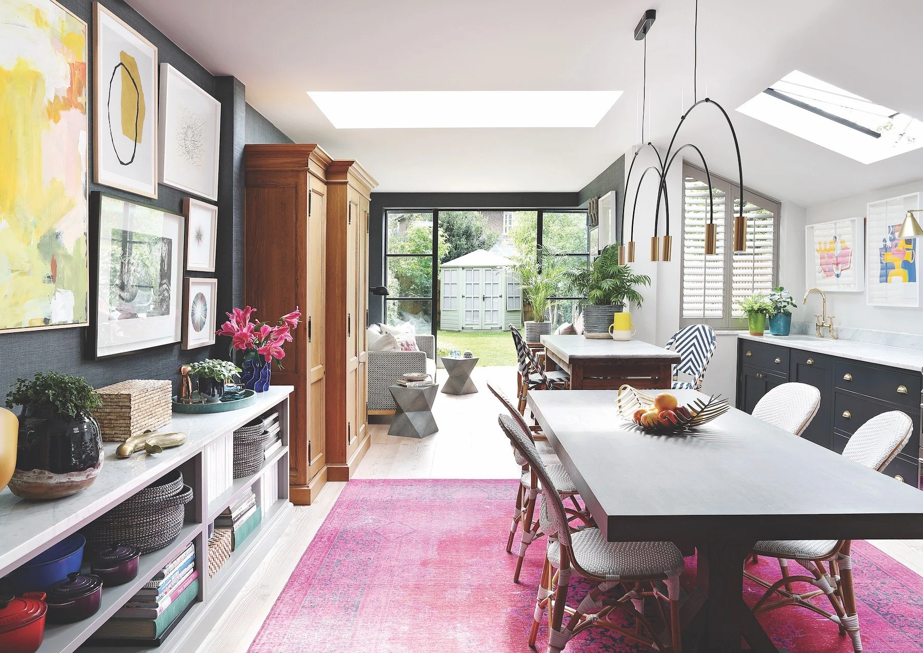
Yellow is probably the colour that I use most,” says Kim, “but always in small quantities and I always make sure that it sits closely to something black and white.” The abstract artwork in the hallway was purchased in Cape Town, and the rattan bench was picked up at a junk store in London.
As anyone will know who has tried to put together a scheme using a range of bright shades, it’s not easy to get it right. Kim says that to make colour work in interiors, tempering it with neutrals and texture is important. Here in her own home, she made sure both elements were effectively used.
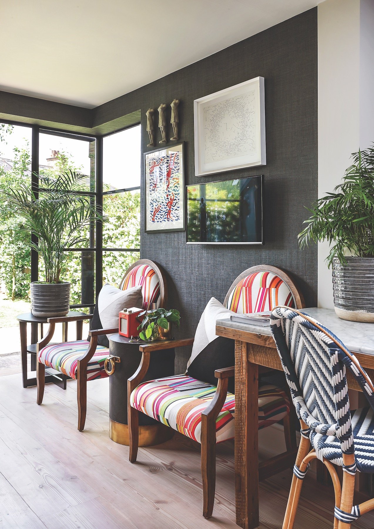
An example is the textured charcoal wallpaper that covers one long wall in the open-plan ground floor, and then wraps around the far end of the living space to subtly demarcate the lounge area. The wallpaper is one of Kim’s signature materials. “It is the perfect antidote to my full-on colour, and art looks amazing against it. It brings warmth and texture and the light bounces off the linen-like effect of the paper.”
Against this neutral backdrop, Kim has used a combination of bold pieces – the acid-pink rug, and the abstract artworks that feature various shades of yellow – as well as a cleverly chosen pendant light fitting to make the space come alive.
But these elements all came together very organically, says Kim. “I spend so much time meticulously planning interiors within my work sphere, so I quite enjoyed just letting this space develop its own personality over time.”

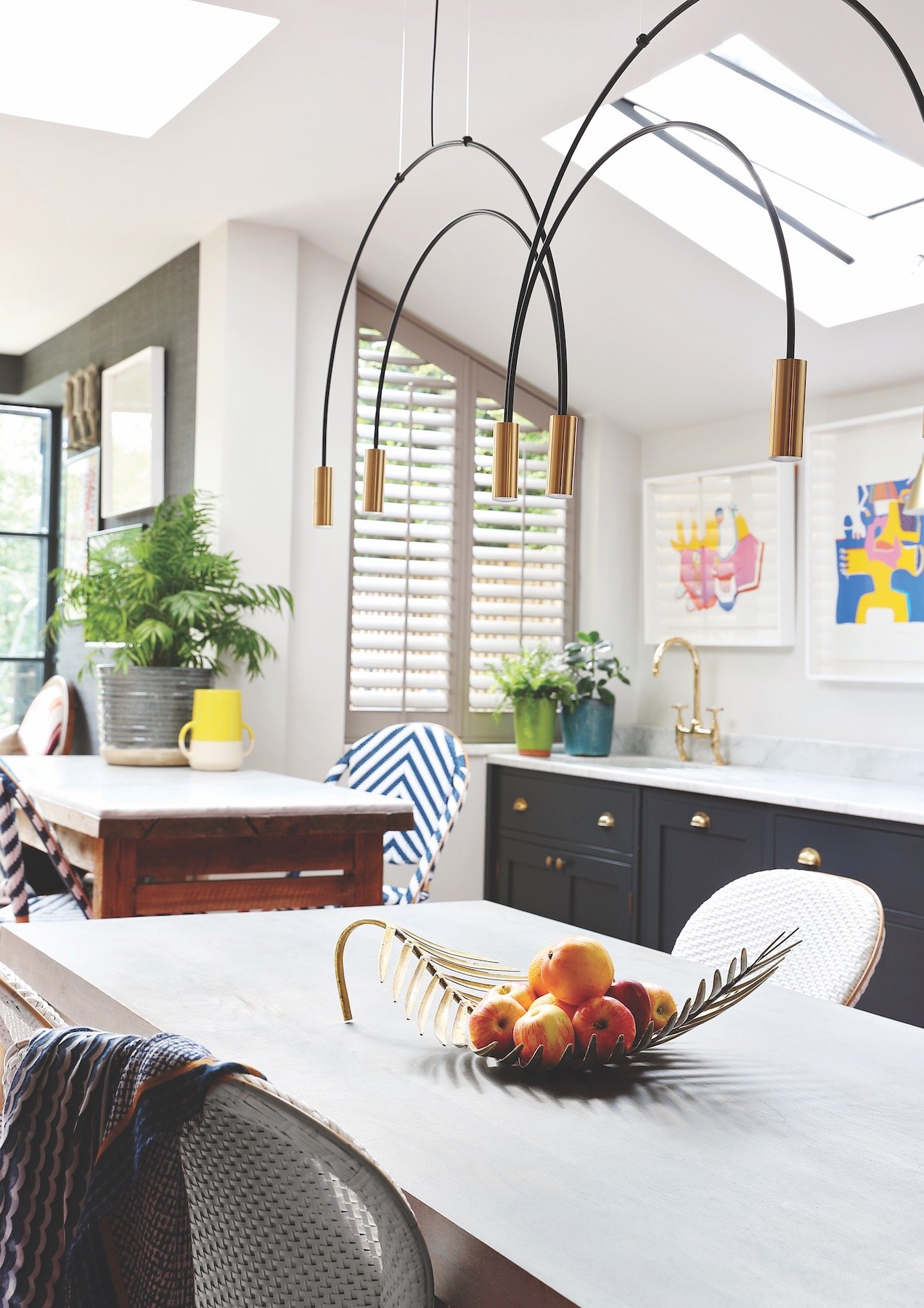
Homeowner and interior designer Kim Stephens was very happy with the kitchen design by a previous owner. However, to create a multifunctional kitchen island in the space, she had a simple freestanding wooden structure made and topped it with honed Carrara marble. “It’s now an integral part of the kitchen – it serves as a breakfast bar, workstation and drinks prep area. It becomes a central hub for people to congregate around.”
The house had previously been given a considered structural renovation. This meant that its classic London terraced house layout had been enhanced with built-in storage, high-quality appliances and skylights that give several rooms a greater sense of spaciousness.
The home’s location in Barnes, a district in south London, is another vital part of its appeal to Kim, her husband Graham and their two children. “Barnes has a really village-like feel,” says Kim, “with a beautiful green, a pond with ducks and a high street with mostly traditional independent shops. When we moved here from South Africa, Graham loved the idea of living in a country village, but I really wanted to be in London – and to our surprise, we got both boxes ticked when we arrived in Barnes.”
While the entire family enjoys life out and about, they all equally relish time spent in their home’s more private spaces. Upstairs, Kim has created a cocooning yet contemporary master bedroom that features an upholstered headboard in a bold blue pattern. More graphic pieces in the form of scatter cushions are punctuated with a mix of blue and yellow throws. The effect is breezy – yet a moodier atmosphere can be created with the inclusion of velvety textured throws and accessories in deeper blues.


Jamie’s bed is situated directly beneath one of the skylights, so in summer when the skylight can be left open, he feels like he is outdoors and under the stars. Says Kim: “We also needed to make the space practical, so he has double desks – one for online gaming and one for homework.”
Also on the first floor is daughter Anna’s room, and son Jamie’s is situated on the loft level above. Both rooms reflect their personalities and came together as true collaborations. “Jamie wanted a room that felt like his own little den, and Anna seems to acquire and collect all sorts of toys, artwork and knick-knacks, hence the emphasis on display in her room.”
Back downstairs in Kim’s home office – situated at the front of the house – a monochrome patterned wallpaper repeats another of her signatures: the use of black and white as a neutral. “I find it jazzy and light, and it brings me joy while I work.”
Nowhere is more an extravaganza of pattern and colour than the powder room, with its blue ikat wallpaper and large brass-framed mirror. Kim says this is the place to go a little mad in. “You are in there for such a short time and it’s such a great opportunity to give someone an experience. I want them to come out with a sense of wonder.”
Which is a very good way to describe this effortlessly chic house in general.