Fresh start
Interior designer Lynne Harris-Whitfield has melded old and new in her relaxed family home in Cape Town, which combines considered space planning with a trove of creative touches.
WORDS Liz Morris PHOTOGRAPHY Elsa Young/Bureaux PRODUCTION Sven Alberding
Tucked away at the end of a small area in Cape Town in a neighbourhood well known for its attractive Victorian-era villas is the home of interior designer Lynne Harris-Whitfield. Set back from the road, behind a squad of square-pruned trees, the house reveals itself as something special, combining a familiar sense of Victorian poise with a very atypical flat roof in its second-floor addition.
Lynne and her husband Gavin bought the house 13 years ago before they had a family. At that stage, it was a single-storey, three-bedroom cottage with good bones and an unusual double gable. A week before they moved in, disaster struck in the form of a fire that gutted the interior, but they decided to turn adversity into advantage. So, they rebuilt, replacing many of the original period finishes (including floors, doors and fireplaces) with more contemporary versions.
Several years later – at which point Lynne and Gavin had two young daughters and a son on the way – the family needed more space but didn’t want to move because they loved the location. So they embarked on a further extensive alteration and addition. This resulted in the creation of two additional bedrooms for the girls on a new first floor, and generated both better flow and a more modern, user-friendly ground level that also enabled better use of the outdoor spaces.


Getting approval for the plans for the first-floor extension involved an application to the South African National Heritage Council – which turned out to prefer a contemporary profile for the rooftop addition rather than an imitative Victorian-style design. The limited- edition nature of the original blueprints for the villas built in Cape Town during the last years of the 19th century meant that the roof profile should not be changed in a way that suggested it was a further version of those original designs but should be done in a way that worked with the existing structure.
Lynne’s background in interior architecture, as well as stints as a design consultant and trend analyst for a fashion, food and lifestyle retail chain, gave her all the resources she needed to drive the design direction herself. She also knew from living in the house that there was potential to be unlocked from the property. The aim was to update floor plans and use colour, finishes and contemporary design savvy to take it to the next level, while also retaining the original home’s character.
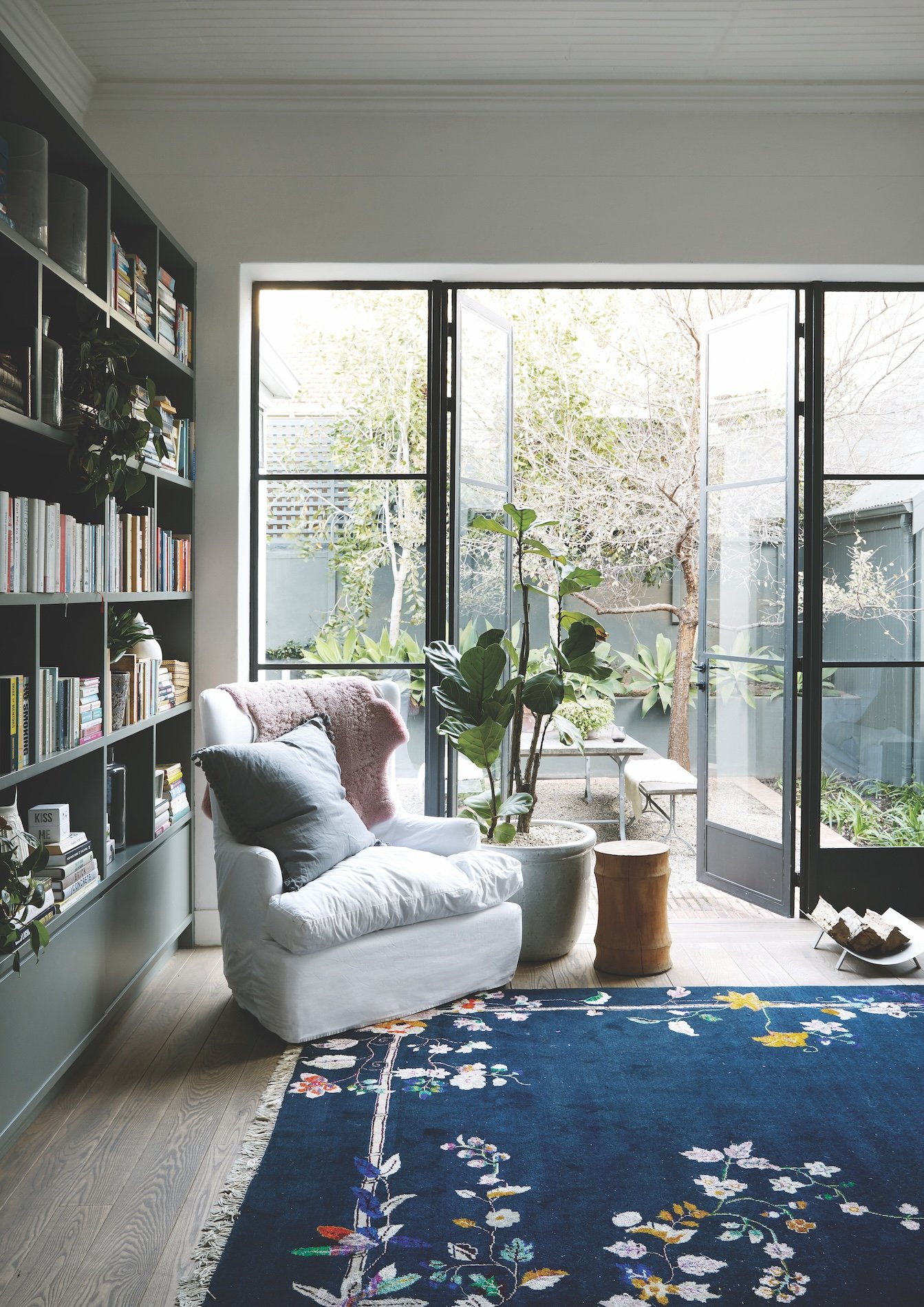
The renovation opened up the living area to make better access to a sunny back courtyard via large steel-framed glass doors, essentially creating a social family space that runs the length of the house.


LHW Studio, Lynne’s interior design practice, is known for taking this approach to projects, and for the relaxed and easy-going spaces that it creates.
“It’s about getting the volumes and flow right, getting the junctions between spaces smooth, and getting the light right,” says Lynne. Easier said than done, for most of us.
While much of the focus of the rebuild was on opening up the interiors and improving the flow between the kitchen, dining, living and outdoor areas, Lynne says she is not a huge fan of fully open plan living. Instead, it was important for her to find a middle point between expanding spaces and containing them too.
“I like to use colour and material finishes almost as structural tools, to visually zone or link spaces where there are no actual physical links,” she says.
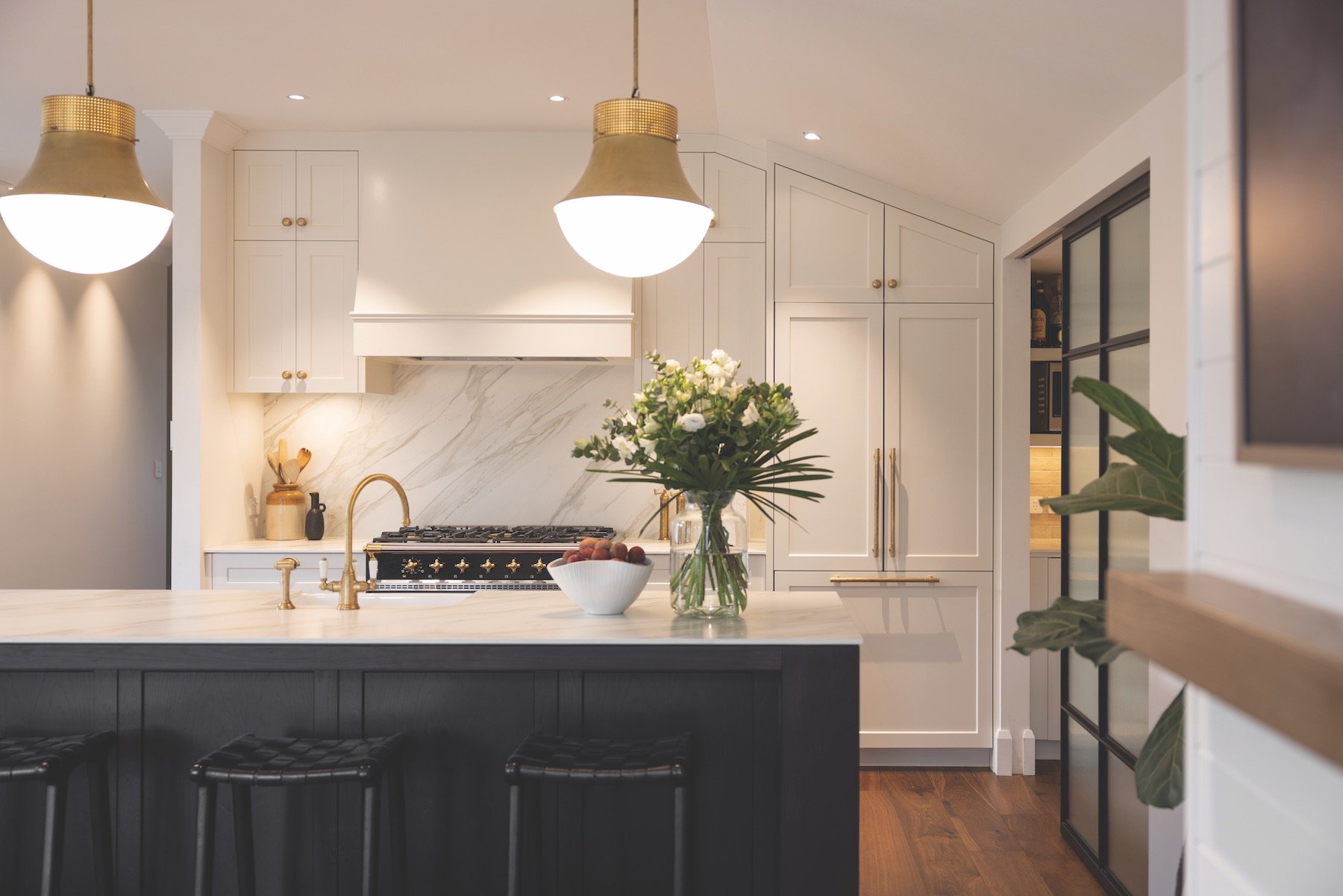
Asked about the home’s distinctive yet understated palette of colours and textures, Lynne says, “Key notes were a blackish burnt umber for metal finishes; white tones for marble and tiles; and a particular grey-green eucalyptus colour, which I used for certain walls and all cabinetry on the ground floor.” For the finishing touches, she says: “Wood with a grain; brass; a woven basketry element for texture; ceramics for a crafty touch; and lots of leafy plants.”


The vanity in the main bathroom is a cantilevered oak cabinet of drawers with
a Carrara marble top.

In the main ensuite bathroom, the freestanding bathtub adds sculptural form to the narrow space. Brass tapware was used throughout the house as Lynne feels it looks more lived in.
Lynne has her paint colours formulated for her by a colour specialist. “Choosing paint that way is foolproof in that you get the perfect colours for your mood board. And avoiding mistakes means that everything works out quicker and cheaper.”
While the spaces at ground level feel mellow and relaxed, the new first floor has a more light-hearted and playful atmosphere. Seen from the outside, the addition is unapologetically boxy, and inside it’s the ultimate attic, designed to max out the limited space available with two bedrooms plus a bathroom. These rooms are linked together by a short passageway that features lots of built-in storage and a desk where Lynne’s daughters do their homework.
And when it came to creating the decor in their rooms, the kids have every say, says Lynne. As a result, each of the spaces has a different riff on the layering of printed and embroidered bedding, plus fun, feminine elements that animate the entire floor via a mix of vintage, retro and modern whimsy.
Similarly, when decorating the living area downstairs, Lynne went for a very easy-going look and feel, which centres around four seating pieces – all of which are slipcovered in white and positioned on a dashing floral rug. The combination works perfectly as a comfy, cosy adjunct to the tight edit of hard design elements in the reworked space. “I like to start with the best fit-for-purpose finishes,” says Lynne, “and simply have fun with the rest.”