
Black-tie affair
A dapper addition by Rogan Nash Architects means this 1960s weatherboard home is now perfectly tailored to modern living.
WORDS Cassie Doherty PHOTOGRAPHY Simon Wilson
An elegant, well-cut suit: that’s how Kate Rogan and Eva Nash of Rogan Nash Architects characterise the feel of this extension to a 1960s bungalow in Tamaki Makaurau Auckland’s Meadowbank.
“These dark corrugate-clad houses really have that feel of a pinstripe,” says Kate. “And the extension did have to be very precisely designed to shoehorn into the site.”
Even the jaunty triangular windows are reminiscent of bow-ties.
It’s a whimsical description for what’s actually a deceptively simple, hardworking design underpinned by careful attention to detail.

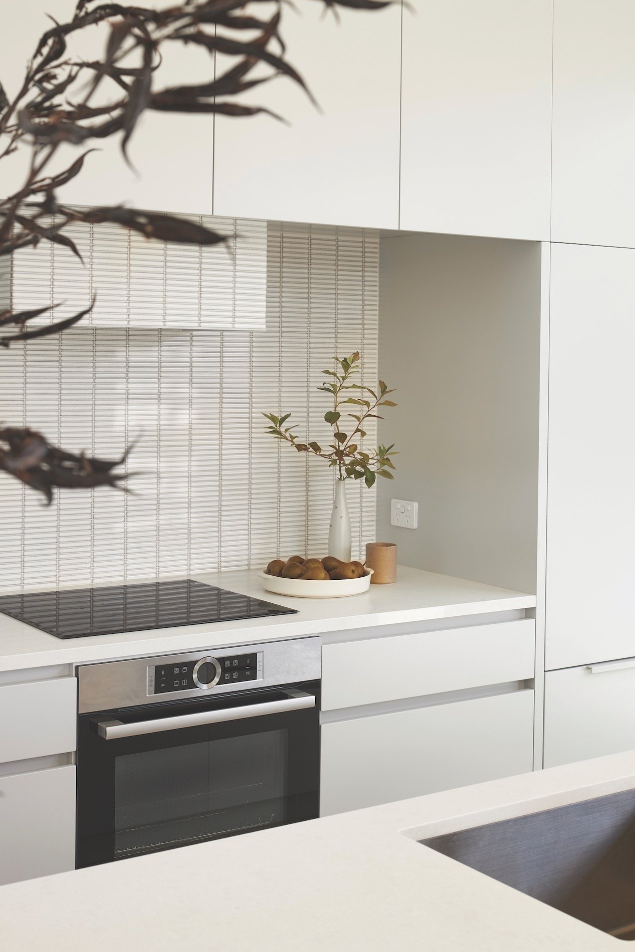
Easy flow: The pale grey kitchen is by Thermacraft. The wine fridge was located in the island to connect the kitchen to the dining area. Clever design makes the pavilion feel spacious, even though architect Eva Nash of Rogan Nash says the kitchen is actually relatively compact in plan.
The homeowners are a young family who had outgrown the slightly dated house, despite still loving its original charm.
“The kitchen was behind a half-wall with a little dining table in the corner,” says Eva. “There was an old- fashioned aluminium ranch slider that didn’t really open, and a narrow concrete strip. It’s a good-sized section, but it felt very disconnected. They felt stuck inside.”
The orientation didn’t suit the site. “One bedroom would overheat, and the other bedroom was too cold. It was one of those sites where the sun was on the wrong side of the house, so it just didn’t work very well,” says Eva.

The homeowners were keen to do as much as they could but without a vast extension. “They wanted it to be modern, and they wanted it to be crisp,” says Kate. “But it still had to work with the aesthetic of the existing house, and they didn't want it to feel too ostentatious.”
There was even more to consider. The owners hoped to retain a good amount of lawn at the back of the house, and they were in luck because existing infrastructure ruled out that area as a location for any extensions. And they really wanted a swimming pool. There were a lot of puzzle pieces to fit together.
“It was about making it work more efficiently,” says Kate. “How can we make it a little bit warmer, make use of the existing site and the sun, think about sustainability issues, and not throw everything away but really enhance what we have?”
The unconventional solution is an addition connected to the side of the house.
“Really, this renovation called for a new pavilion for those public spaces of the home: living, dining, kitchen.”
It’s a single gable form, referencing the shape of the mid-century original, but clad in dark vertical Colorsteel to contrast the light horizontal weatherboards.
“It’s a beautiful lofty space,” says Eva. “It’s facing the street, but it has the ultimate in privacy, and it’s connected to the sunlight at all times, with especially wonderful westerly sun pouring in every afternoon.”

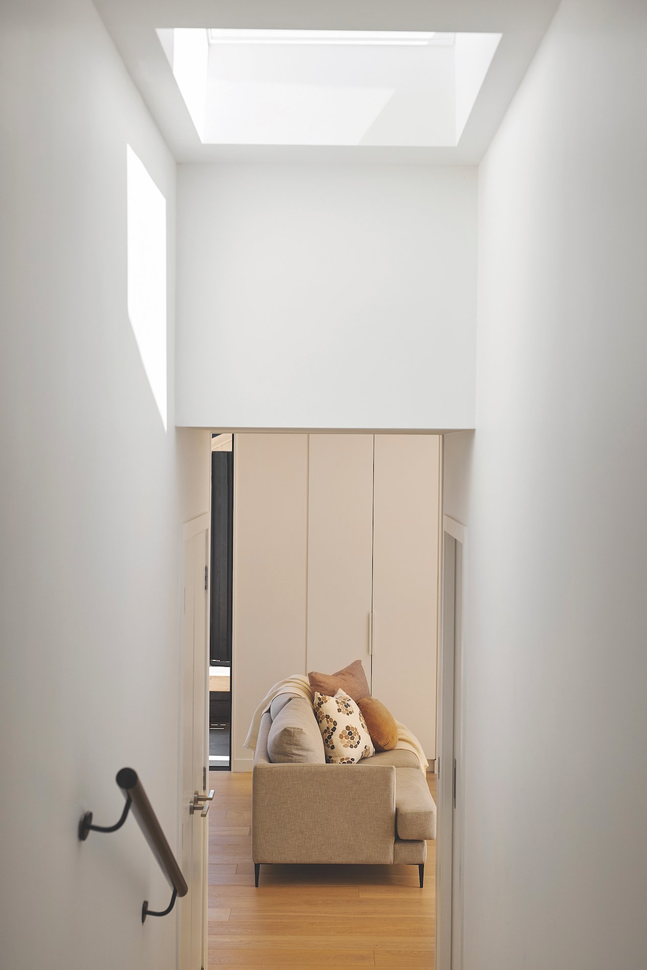
Making connections: A change in levels between the existing house and the new addition keeps some separation between entertaining areas and private spaces.
Those high, bow-tie windows bring in light and views of neighbouring treetops. Large sliders open to a courtyard at the side with a pool tucked against the front boundary, and a smaller slider connects to a deck and the backyard.
The pavilion is built on a concrete slab, but timber flooring gives a feeling of warmth and connects it to the original part of the house.
The kitchen is a pale grey colour. “We did want it to recede back so the room feels as spacious as possible,” says Eva. “With it being so sunny and light-filled, having light-coloured cabinetry means it does feel nice and voluminous.”
The finger tile splashback adds texture and was inspired by some of the Japandi references the homeowners had shared. Says Kate: “I think that Scandinavian minimalism really works with a Japanese aesthetic. It plays so well into a 1960s-style house.”
Kate and Eva like to design every aspect of a project, down to interior details and furnishings as well as landscaping. Here, they collaborated closely with Strachan Group Landscape Architects (SGLA).
“They have a real understanding of what we were wanting to achieve,” says Eva. “We do think it’s important to consider the landscape and how the house touches the land, so it’s an integral part of the design. All the landscaping was our design, including the pool, and SGLA has done a beautiful job of bringing that to life.”
Adds Kate: “The swimming pool is a very simple form, but it just glows. The tall concrete block wall is rendered and provides privacy from the street. It makes the courtyard feel like a little enclave outside and gives it such a strong relationship with the pavilion.”
The home’s new entrance is in the connective section between the pavilion and the original house, and this is an important space for Eva and Kate. A louvred window in the kitchen allows a glimpse at the front door. “So you can see who’s coming and give them a friendly wave before they get there,” says Kate.
Inside, a nook provides a practical seat and drawer but also a welcoming experience and a small chance to decompress. “We like the idea that there’s a moment of threshold when you arrive home, and we like to celebrate that. Even though it’s very simple in this house, it still is very effective.”
Thanks to a sloping site, there’s a change in levels between the two forms of the house.
“We used that to our advantage,” says Eva, “because it differentiates the public space from the private. Although rooms might be right next to each other, and there is another lounge next to the pavilion, as soon as you change levels up or down a few steps, it feels like it’s quite separate.”
It’s one of many spatial details Kate and Eva always consider. “We’re always trying to make our plans work hard. We try to make the best use of space and not have any wasted areas.” Kate agrees. “There’s nothing wrong with having breath in a plan. That’s definitely something that you want, but it needs to be a considered moment.”

On deck: “The pavilion has multiple outdoor living spaces, depending on where the sun is,” says Eva. “And there are a lot of options for ventilation as well.”
When the old kitchen and living room were relocated into the new pavilion, that area became a spacious new master suite. The existing house was also upgraded with new double-glazing, insulation and flow to the backyard. “Now it feels super generous. The homeowners told us that it was a really nice surprise. They didn’t expect it to feel that way because of how they’d previously experienced that portion of the house,” says Eva.
As directors of Rogan Nash Architects, Kate and Eva work on everything together. To them, that means a more thorough consideration of every aspect of a design, as well as a better understanding of a client and their potential needs. Each will pick up on different cues and bounce around interpretations. It means a richer result.
“This plan has been quite effective for them now and for what they expect for their family in the future,” says Kate. “I think it would probably suit a lot of people, but in particular it really suits the way they like to live and entertain. They’re really happy. It’s been lovely.”
09 361 2548 | rogannash.com


